yoooo these are fire! I love the modernized version of the og jerseys, and youcan never go wrong with the purple prince jerseys.
SpiritualEmployee940
Those are tough
SiriusTen
Yo these with the current city edition color scheme would actually be the best jersey of all time
jdombs
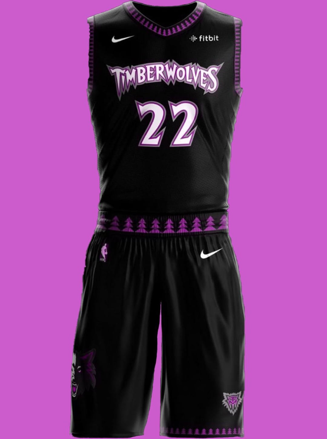
Pretty nice, but I need the forest green back!
achimschneider
These are fantastic 10/10
raven_miyagi666
i actually like these!
this_good_boy
Definitely not mad about these. I always thought this jersey was a little too goofy for me with the font but when they did the Black Tree throwbacks a few years ago then the awesome Alts a couple seasons ago I really love them.
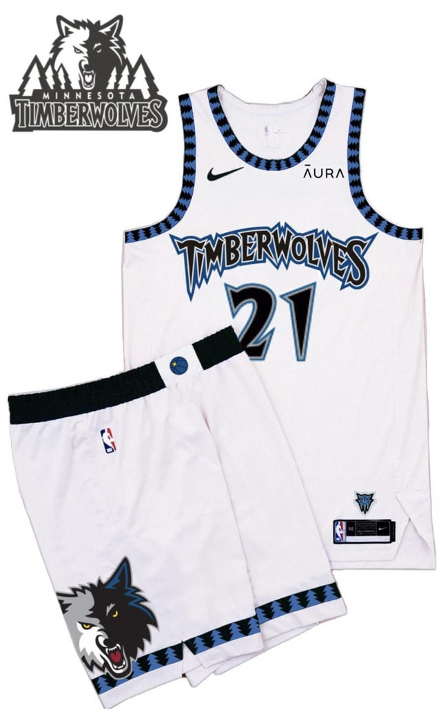
That said I think the recent alts and the black are the colors to go with if we’re throwing back up the tree era. I think the white is just a little too.. something, jarring I guess.
Nice work tho, I’d love to see the original jerseys if you’re feeling like mocking up something close to those!
ABentPlant
I definitely want to bring back the purple as a permanent alt color scheme, but I think that there is some value in keeping the sleeker modern logo and font, especially if they can combine it with the trees and old school one


8 Comments
yoooo these are fire! I love the modernized version of the og jerseys, and youcan never go wrong with the purple prince jerseys.
Those are tough
Yo these with the current city edition color scheme would actually be the best jersey of all time
Pretty nice, but I need the forest green back!
These are fantastic 10/10
i actually like these!
Definitely not mad about these. I always thought this jersey was a little too goofy for me with the font but when they did the Black Tree throwbacks a few years ago then the awesome Alts a couple seasons ago I really love them.
That said I think the recent alts and the black are the colors to go with if we’re throwing back up the tree era. I think the white is just a little too.. something, jarring I guess.
Nice work tho, I’d love to see the original jerseys if you’re feeling like mocking up something close to those!
I definitely want to bring back the purple as a permanent alt color scheme, but I think that there is some value in keeping the sleeker modern logo and font, especially if they can combine it with the trees and old school one