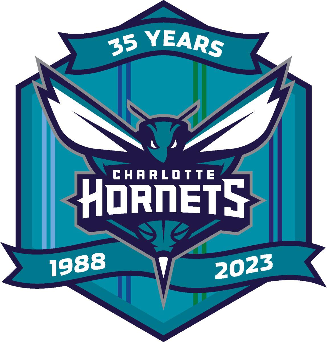
Is the 35th anniversary logo giving us hints on the throwback? Double pinstripes, teal. Baron Davis era. We’ve never thrown back to these since returning to the Hornets name.
Is the 35th anniversary logo giving us hints on the throwback? Double pinstripes, teal. Baron Davis era. We’ve never thrown back to these since returning to the Hornets name.
Seems likely. All I want—not necessarily on an anniversary year—is a Hornets uniform using the Bobcats colors as a city edition.
Legal_Pianist_5743
Appears we’re definitely getting them from the logo. Those were my favorite and truly believed if the 2000 Hornets closed out the Bucks in Game 6 they would have made the ‘01 Finals.
kassius79
I understand that it’s not possible but man I miss the old Hugo logo. It’s been a while to accept this redo but I’m still not really digging this modern Hugo logo.
I think even if the team had never moved to New Orleans, in time the logo would’ve become more fierce and sharp and modern looking.
But I just love that classic 90s logo. Some things are best left unchanged imo like that old school logo. I think it’s timeless like the classic Celtics logo.


3 Comments
Seems likely. All I want—not necessarily on an anniversary year—is a Hornets uniform using the Bobcats colors as a city edition.
Appears we’re definitely getting them from the logo. Those were my favorite and truly believed if the 2000 Hornets closed out the Bucks in Game 6 they would have made the ‘01 Finals.
I understand that it’s not possible but man I miss the old Hugo logo. It’s been a while to accept this redo but I’m still not really digging this modern Hugo logo.
I think even if the team had never moved to New Orleans, in time the logo would’ve become more fierce and sharp and modern looking.
But I just love that classic 90s logo. Some things are best left unchanged imo like that old school logo. I think it’s timeless like the classic Celtics logo.