Hi there. Creative Director here with a couple decades experience in advertising. Coming from that perspective:
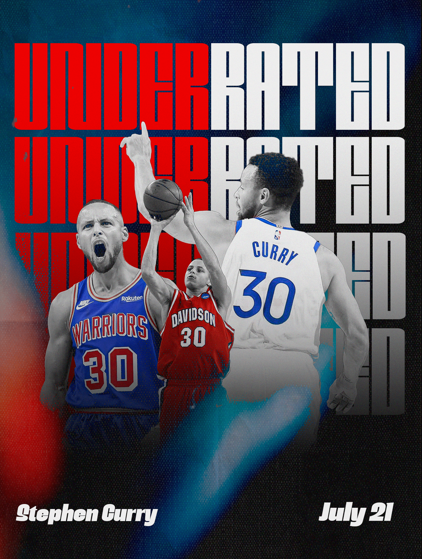
I dig the elements. The boldness of the type, the complexity of the type, almost like a maze, so it has to be decoded, which signals that there’s both an investigative layer and an intellectual layer to the doc.
Also I like the color contrast and the repeating motif – “under” is emotional, dangerous, negative, threatens his legacy and makes him and his fans mad, while on the other side “rated” is objective, good, positive and not shaded by emotion. the repetition reminds us that he’s not just evaluated once, but many times over, like the stacks of seasonal stats throughout his career.
The negative space around the “T” could be explored for storytelling opportunities like making the descending lines read as a scale (invoking the concept of “judgement”) or a graph (invoking the idea of measurement, comparison and/or mathematical analysis.)
The Steph images are cool, but it doesn’t feel like they’re telling me a story, or maybe I’m just not picking up the story you intend. (Are these chosen as three key moments from his career that demonstrate how he’s underrated?)
Graphically, the images are a little smushed together and positioned in a way that might not be the most balanced.
Here’s what I’d reco exploring: simplify the image story, and make it align with and reinforce the typography story. Maybe find two profiles of Steph, where one looks down and might have worry, fatigue, blank stare with the mouthpiece hanging out, etc that physically and emotionally feels “under” and like it’s part of his struggle. You could also try using the red letterforms as a window through which you see Steph.
and then on the right you could have a profile of him looking more positive (maybe confident, happy or celebratory) and with an upward eye-line so he looks like he’s looking at the graphic treatment i suggested above for the “T” – this would bring a self-referential layer to make the connection between type and images more intentional.
thanks for sharing your work. hope the reactions and suggestions are helpful. cheers.


3 Comments
Very cool!
Looks like a Clippers poster.
Hi there. Creative Director here with a couple decades experience in advertising. Coming from that perspective:
I dig the elements. The boldness of the type, the complexity of the type, almost like a maze, so it has to be decoded, which signals that there’s both an investigative layer and an intellectual layer to the doc.
Also I like the color contrast and the repeating motif – “under” is emotional, dangerous, negative, threatens his legacy and makes him and his fans mad, while on the other side “rated” is objective, good, positive and not shaded by emotion. the repetition reminds us that he’s not just evaluated once, but many times over, like the stacks of seasonal stats throughout his career.
The negative space around the “T” could be explored for storytelling opportunities like making the descending lines read as a scale (invoking the concept of “judgement”) or a graph (invoking the idea of measurement, comparison and/or mathematical analysis.)
The Steph images are cool, but it doesn’t feel like they’re telling me a story, or maybe I’m just not picking up the story you intend. (Are these chosen as three key moments from his career that demonstrate how he’s underrated?)
Graphically, the images are a little smushed together and positioned in a way that might not be the most balanced.
Here’s what I’d reco exploring: simplify the image story, and make it align with and reinforce the typography story. Maybe find two profiles of Steph, where one looks down and might have worry, fatigue, blank stare with the mouthpiece hanging out, etc that physically and emotionally feels “under” and like it’s part of his struggle. You could also try using the red letterforms as a window through which you see Steph.
and then on the right you could have a profile of him looking more positive (maybe confident, happy or celebratory) and with an upward eye-line so he looks like he’s looking at the graphic treatment i suggested above for the “T” – this would bring a self-referential layer to make the connection between type and images more intentional.
thanks for sharing your work. hope the reactions and suggestions are helpful. cheers.