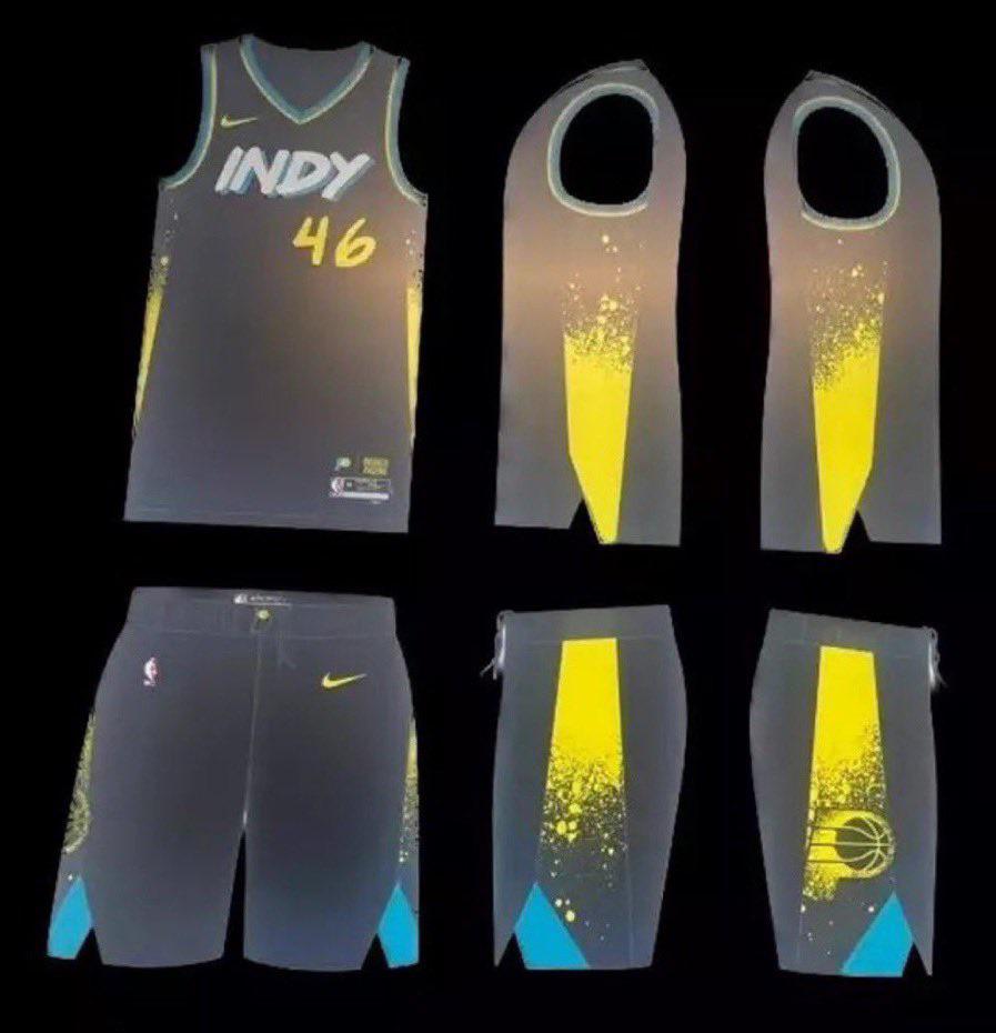
Something the Fly Girls on In Living Color would wear.
ShopCartRicky
They look like someone slapped an EA Sports menu on some basketball jerseys.
SlickWickk
“Not technically Indy” 🤣
This clearly ties into how Indy roads are perpetually under construction, drawing inspiration from the splattered center line paint all over your Toyota Corolla.
TheBlakeRunner
Ah yes, Indiana, the Mecca for graffiti art. I don’t hate them, certainly not our worst jersey. Give us a “Naptown” jersey you cowards!
WaxMuseumPodcast
Ugh why is this so difficult.
goosemane33
Damn these are ass
MountingFrustration
Yeah why would they put ‘Indy’ on the ‘City Edition’ jerseys??
minivan69
I’ll do the compliment sandwich critique.
1.) I like them more than the 22-23 version 2.) That font looks like it’d be an option in a video game’s jersey creation mode 3.) I like that they went for the fluorescent yellow and blue colors
HoosierBoy317
I like them
Egg2124_yt
Shorts are clean, I think I’d need to see one of our guys wearing them first
yaboiinick
Not sure where the greenish blue even comes from, and the yellow looks like it’s neon. I’m really hoping some tweaks are made to these cause they kinda look like they tried to recreate terrible mavs city edition from 2019. Also the font is meh. Bummed with these and the ones from last year but hopefully they look better in person. I feel like they’ve been trying to get way too creative these past few years when something nice and simple would’ve been good
StanceLephenson
I think they’ll be sweet in person. I like that they are switching it up.
cm_fanelli
In a limited run, I actually really like them. It’s definitely a fun change of pace. I’m ready for them to revamp our regular uniforms.
shovels7
WE THA INDY
ThatDudeUKnow92
Whoever designed those should be tried at the Hague for committing work crimes.
Servbot24
Thank god it’s not race car themed
chadowan
Looks like a shart
TheGeoninja
Clearly a sign from the powers that be that the Pacers are going to be great this year. Highlight reel plays every night while wearing the worst jerseys possible
BoogerSugarSovereign
I haven’t seen the others but if we’re the only ones using this spray paint style piping it’s at least unique. I like the colors chosen for the blue and yellow but not as certain about the grey-black base. Need to see it in person but I’d say this ranks towards the middle of our city edition looks, definitely above 2 or 3 just from recollection


20 Comments
I love them. I want to buy the shorts to hoop in
These are much better than last years!
Something the Fly Girls on In Living Color would wear.
They look like someone slapped an EA Sports menu on some basketball jerseys.
“Not technically Indy” 🤣
This clearly ties into how Indy roads are perpetually under construction, drawing inspiration from the splattered center line paint all over your Toyota Corolla.
Ah yes, Indiana, the Mecca for graffiti art. I don’t hate them, certainly not our worst jersey. Give us a “Naptown” jersey you cowards!
Ugh why is this so difficult.
Damn these are ass
Yeah why would they put ‘Indy’ on the ‘City Edition’ jerseys??
I’ll do the compliment sandwich critique.
1.) I like them more than the 22-23 version
2.) That font looks like it’d be an option in a video game’s jersey creation mode
3.) I like that they went for the fluorescent yellow and blue colors
I like them
Shorts are clean, I think I’d need to see one of our guys wearing them first
Not sure where the greenish blue even comes from, and the yellow looks like it’s neon. I’m really hoping some tweaks are made to these cause they kinda look like they tried to recreate terrible mavs city edition from 2019. Also the font is meh. Bummed with these and the ones from last year but hopefully they look better in person. I feel like they’ve been trying to get way too creative these past few years when something nice and simple would’ve been good
I think they’ll be sweet in person. I like that they are switching it up.
In a limited run, I actually really like them. It’s definitely a fun change of pace. I’m ready for them to revamp our regular uniforms.
WE THA INDY
Whoever designed those should be tried at the Hague for committing work crimes.
Thank god it’s not race car themed
Looks like a shart
Clearly a sign from the powers that be that the Pacers are going to be great this year. Highlight reel plays every night while wearing the worst jerseys possible
I haven’t seen the others but if we’re the only ones using this spray paint style piping it’s at least unique. I like the colors chosen for the blue and yellow but not as certain about the grey-black base. Need to see it in person but I’d say this ranks towards the middle of our city edition looks, definitely above 2 or 3 just from recollection