
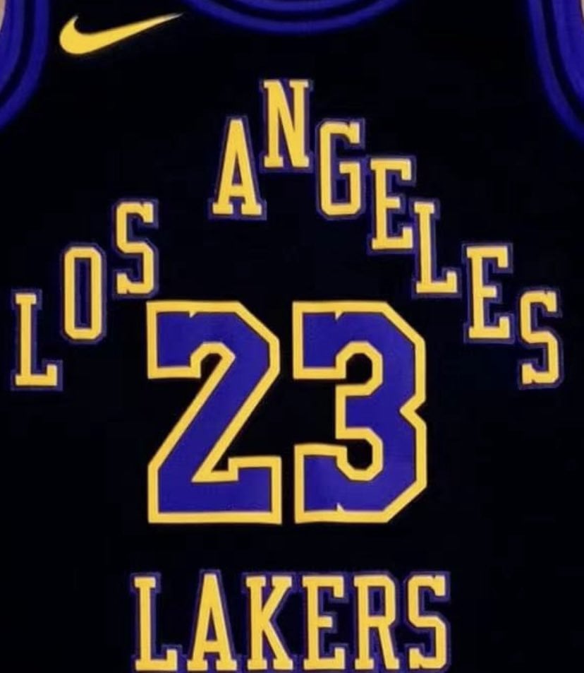
Looks like this upcoming season’s city jersey has been leaked. Thoughts?
Kinda like them, though I feel like i’ve seen that jersey before, but in a home gold with purple font.
It may have been a remix jersey from Nike in the early 2000s just not sure.
by kavanaheav

18 Comments
Thanks, I hate it.
Although it is better than the mostly white with purple/black number/lettering city edition uniforms we had last season
Eh…
Did we partner with Wish again? Seriously the letter spacing is atrocious. Look how far the L is from O and how close ANG are
Worst jerseys of the Nike era if true which is saying something
Nike’s obsession with black continues
Too busy and doesn’t have our signature font anywhere.
Who approved this…
I like the Hollywood color way, but keep it simple…
As much as I hate to believe this is true, the logo looks exactly like the sides of the [75th anniversary shorts.](https://fanatics.frgimages.com/los-angeles-lakers/mens-nike-purple/blue-los-angeles-lakers-2021/22-city-edition-swingman-shorts_pi4252000_altimages_ff_4252127-ca7f3465ad6ae9abd6a1alt4_full.jpg?_hv=2&w=900) so it might be a real leak.
Is this supposed to be a part of the lore series still? I don’t get why they can’t do a city jersey based off the Hollywood sign
i actually like the font and the color(I like black jersey thats why). Just rearrange the ‘Los Angeles” then it would be cool i guess
this is disgusting
They need to bring back the mamba jersey
My 2 year old can design a better jersey.
Pyramid scheme jerseys
🗑
Why can’t they just bring back the mamba jerseys and the showtimes ones!
If this is real it’s absolutely the worst Laker jersey I’ve ever seen
STOP WITH THE FUCKING BLACK JERSEYS.
Unless they’re bringing back the mamba jersey I don’t want to see it. And FFS, they changed the purple this season but still can’t fix the yellow?? I swear Nike is just giving the fans the middle finger lol
That looks fake as shit
Lmao the worst thing I’ve ever seen, that can’t be real