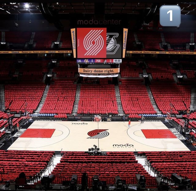
I like the one with the key painted white. Kind of a minimalist vibe. I might like the new one second.
Shaqting
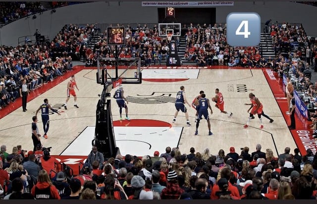
I’m confused by #4 – it’s the 50th anniversary floor, but they’re playing at Memorial Coliseum?
Damezang
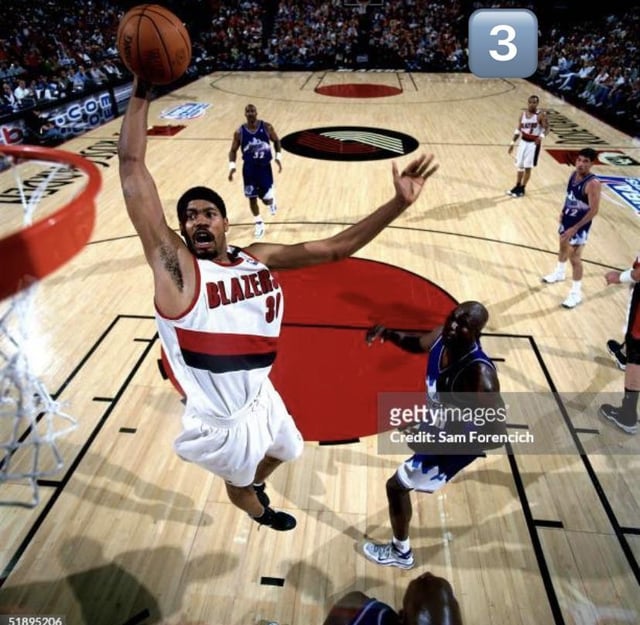
#3 Rose Garden for me
J-Duggs
#3, love that specific pinwheel design
However, the best court in team history is the early 90’s Drexler era. Just the amount of white used without overdoing it like the recent throwback court
TraliBalzers
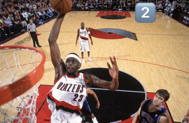
Number 4 is the primo for me. Love the old logo and old font.
peakchungus
Tie between the 50th anniversary court and the current court.
narhwalmun
I think I gotta go with #2 or the new one
Strong_Confection628
#5
cbtikal
I’m starting to like the current court but #5 was just *chefs kiss*
Daddy_Milk
One, two, three.
plantsarepowerful
#2 looking nice
Responsible-Knee6288
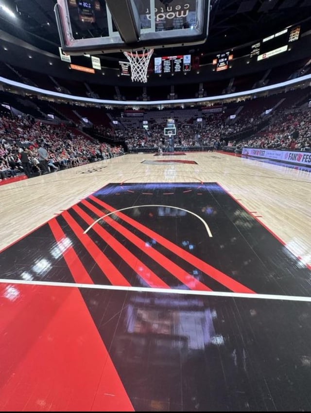
The ones with black in them look better across the board imo. It’s part of our colour scheme but it’s been sorely lacking in court design the past few years until now.
DrTom
It’s #3 and #4 for me.
drunkenyeknom
Gotta be 4 for me I like the color combos
KingKongKaram
I like the newest one most
usaytomatoisaytomato
#5, love the contrast around the natty in the paint
jakobburns01
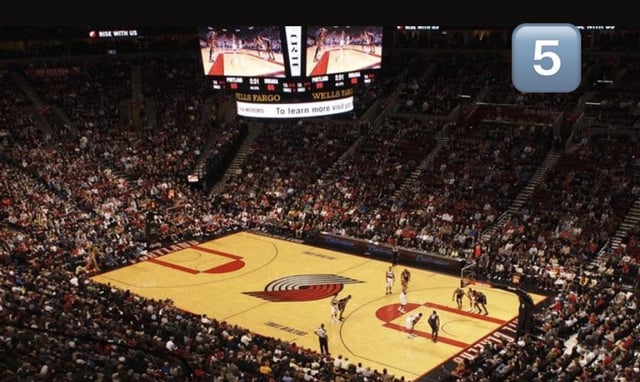
Why’d you get the worst pic for the last one?
ponder_grace
The white key is my favorite look. Reminds me of the 90’s blazers for some reason.
BoxOfDOG
Last night was my first time seeing the new design in person, and I honestly really love the look. Was surprised to see people shitting on it when they revealed the digital mockup.


21 Comments
I like the one with the key painted white. Kind of a minimalist vibe. I might like the new one second.
I’m confused by #4 – it’s the 50th anniversary floor, but they’re playing at Memorial Coliseum?
#3 Rose Garden for me
#3, love that specific pinwheel design
However, the best court in team history is the early 90’s Drexler era. Just the amount of white used without overdoing it like the recent throwback court
Number 4 is the primo for me. Love the old logo and old font.
Tie between the 50th anniversary court and the current court.
I think I gotta go with #2 or the new one
#5
I’m starting to like the current court but #5 was just *chefs kiss*
One, two, three.
#2 looking nice
The ones with black in them look better across the board imo. It’s part of our colour scheme but it’s been sorely lacking in court design the past few years until now.
It’s #3 and #4 for me.
Gotta be 4 for me I like the color combos
I like the newest one most
#5, love the contrast around the natty in the paint
Why’d you get the worst pic for the last one?
The white key is my favorite look. Reminds me of the 90’s blazers for some reason.
Last night was my first time seeing the new design in person, and I honestly really love the look. Was surprised to see people shitting on it when they revealed the digital mockup.
5
4 and 6 are clean AF