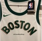
[CelticsGRD] Celtics 2023-24 City Edition Jersey has leaked.
Celtics 2023-24 City Edition Jersey has leaked.
I’m curious to see the numbers, but so far I love this, I like the gold on the sides. pic.twitter.com/flxLfEPf0W
— GreenRunsDeep (@CelticsGRD) October 18, 2023
by tacko2020


34 Comments
These are some jerseys if I’ve ever seen them
Looney Tunes ass font
I wonder what the person who designed that did after the 5 minutes he spent on this?
These are so bad. Why not just keep the ones from last year?
These are Bucks colors.
I’d love them to take the Red Sox font and numbers and use that on a jersey.
Celtics Shitty Edition Jersey
[deleted]
It’s like they go out of their way to make them look like shit nowadays
Imo these look like boxing robes
Nike employs tons of artists and designers and you’re telling me none of them can make some sick ass designs? Not saying this is the worst city edition compared to some other teams, but cmon
Maybe AI should become more of a threat just so people stop doing a piss poor job like this
Goddamn why does Nike suck so much ass
All of these City Edition jersey’s stink. Out loud.
As much complaints as these are getting, I like em a whole lot more than some of the other city edition jerseys from other teams that have leaked. That heat one- yikes
Hate em. It’s like Clip Art from 1995
They should make one look like a Jameson bottle
Idk about a jersey but I might get a Tshirt with this theme
What is the fascination with jersey designs, I don’t get it?
It’s funny that every year fan concept jerseys are significantly better than the actual jerseys Nike makes
Need a purple Holy Cross inspired jersey next season, honoring Cousy, Tommy, etc.
Wish we just kept the alts from the Kyrie Hayward days reminiscent of the bird warmup jackets . These were fire
Whites: https://encrypted-tbn0.gstatic.com/images?q=tbn:ANd9GcSjhWYpYqMSc8-iwM56RrgEjhO6lLRpdtumCw&usqp=CAU
Green: https://encrypted-tbn0.gstatic.com/images?q=tbn:ANd9GcSG1oGf0RrHvGllQOHG8tfqtUkTMXHpMcyCyw&usqp=CAU
I would have been happy with last year’s tbh those were the best
certainly the jerseys of all time
Why do they keep eliminating the color green??
These new jersey designs every year are so forced and it’s just like 5th year when nike makes them. Just imagine what shit designs we will see in 10 years.
Nike sucks.
[They look much better with the numbers printed on them.](https://www.reddit.com/r/bostonceltics/s/QWDoLu44aB)
🤮
These rule, y’all crazy. It’s not the same boring shit as usual the font and colors are pretty unique, the off-white, the drop shadow. The vista print logo (check their social) has this cool shield to it and the detail in the bottom right is fun. This is a great 60s throwback jersey.
Edit to continue being excited: Look at the social post. The shorts are dope. There’s a parquet pattern on the sides that’s dope. It’s good.
tf is this shit?
Jersey could be laker gold and purple and that guy would eat it up. Lol he likes anything with the word Celtics on it
🤢
God awful