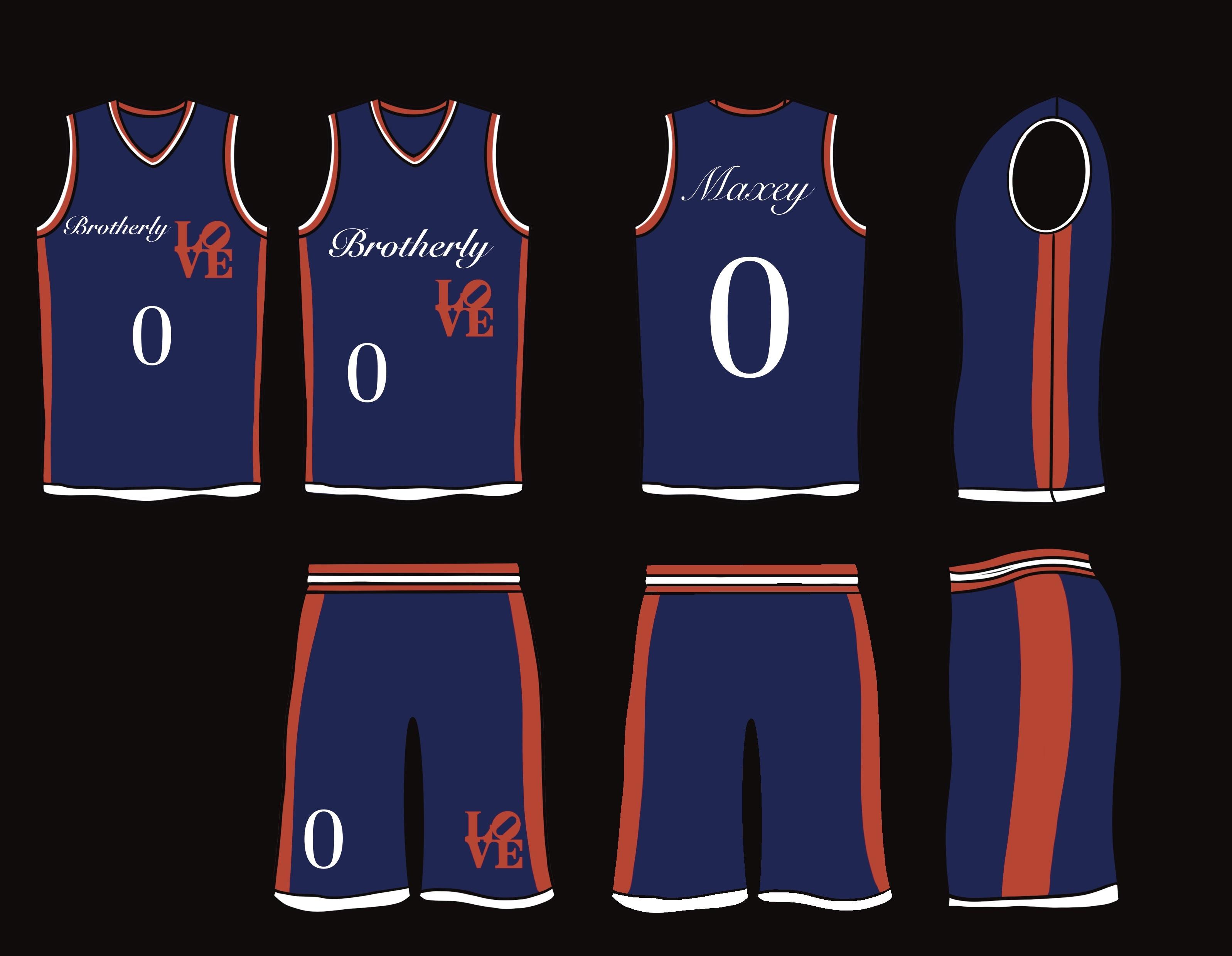
Sorry, not a fan. Too hard to read at a glance. The red looks like the wrong shade as well
giacomo-aprile-jr
I like a lot of things about this! Short are great.
I do not dig the font, particularly on the last name.
No_Slice_5911
Its not good brother, but you are not getting paid by a multi billion franchise to do this, but someone did and got a design worse than yours.
JCPRuckus
I’m not in love with it. But I think the one with the offset number is at least visually interesting.
cydetrack

ImpossibleFact7
A little too much empty space for me, and the red looks too orange. I like the idea of using the love sign tho, that’s nice. Font is also too cursive for me. Nice try tho brother
iamsosmrt84
That cursive font just doesn’t look good on a jersey.
I actually think they should use the City editions to dabble with an update on the AI 90s jersey that some people love so much.
Black_Dumbledore
I’m not crazy about it but Ido like the inclusion of the Love Park iconography. That’s seems like such a no-brainer if they’re insistent on using “Brotherly Love”. I suspect it might be a copyright/legal issue. If that’s the case I would maybe change the letters to PHLY or something.
Ok-Nature-3991
Love the colors, back and sides. Can’t read the cursive and feels a bit out of place
mikeq11
I actually really like the shorts, the top not so much


10 Comments
Sorry, not a fan. Too hard to read at a glance. The red looks like the wrong shade as well
I like a lot of things about this! Short are great.
I do not dig the font, particularly on the last name.
Its not good brother, but you are not getting paid by a multi billion franchise to do this, but someone did and got a design worse than yours.
I’m not in love with it. But I think the one with the offset number is at least visually interesting.

A little too much empty space for me, and the red looks too orange. I like the idea of using the love sign tho, that’s nice. Font is also too cursive for me. Nice try tho brother
That cursive font just doesn’t look good on a jersey.
I actually think they should use the City editions to dabble with an update on the AI 90s jersey that some people love so much.
I’m not crazy about it but Ido like the inclusion of the Love Park iconography. That’s seems like such a no-brainer if they’re insistent on using “Brotherly Love”. I suspect it might be a copyright/legal issue. If that’s the case I would maybe change the letters to PHLY or something.
Love the colors, back and sides. Can’t read the cursive and feels a bit out of place
I actually really like the shorts, the top not so much