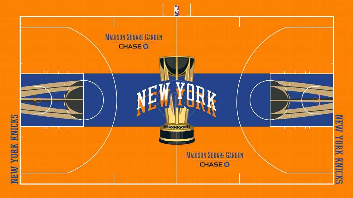
I want to know how you guys feel because IMO, this might be the worst thing to touch the MSG floor since Andrea Bargnani
nedlymandico
I dont
Mattyboy408
I like it, just something different. If they could do this, then why can’t they go back to how they did the Finals also
T-Bills
I really liked last year’s black/orange court that looked like it was for Halloween but turned out it wasn’t.
As for the dupe lettering… I read that the idea is that it spells “New York, New York”. Funny TIL.
cricket9818
Too much orange
If it was nornal color court at the edges and then it faded into orange near center court, I’d dig it
This is an assault on the eyes
thefudd
trash, same as the black court
Mobius24
Garish colors should only be accents. Switch the blue and orange
_aspiringadult
This is fucking hideous
Matthaeu_
I dont get why theyre promoting this in season tournament so hard. Nobody cares about it even the players
sammg2000
It just hit me that the double-vision “New York” is supposed to represent “New York, New York.” Typical City design, really: So obsessed with finding a cute way to represent the local culture that they totally ignore any sense of taste or cleanliness.
I actually don’t hate the orange as much as others because i don’t think it will look like this deep of a color on TV.
dapoktan
it feels like they made it as garish as possible to distract from any discussion about the weird in season tournament
RealSteveScaf
Trash. Looks like a concept someone here would post and ask what we all think lol.
Holiday-Ad-4654
I think they’re trying to blind us so we won’t notice Ju’s turnovers
The_SqueakyWheel
Im intrigued. Theres a lot of orange though
MegaSince93
🔥🔥🔥🔥
blkhwk27
can we just bring adidas back as jersey and court designers bc nikes just not it
porkchopsdapplesauce
Orange is one of my fav colors but that’s too much for me.
DudeLikeYeah
Would be dope with less orange, maybe black?
Snuggle__Monster
I’ll wait and see how it looks on TV
OneThousandDegrees
They’re really pushing the double new york thing. Which would be whatever but it fuckin hurts the eyes. But that could be a me thing
finalfourcuse
They had a team go through ideas and this is what they decided on? How do I get a job doing bullshit?
starks3_
Design is actually pretty nice, but definitely needs less orange.
mm0827
If this is real I will officially accept being old and wish for just one season of everything going back to normal. Just give me the classic court and one set of home and one set of away jerseys…enough of this shit.


30 Comments
I want to know how you guys feel because IMO, this might be the worst thing to touch the MSG floor since Andrea Bargnani
I dont
I like it, just something different. If they could do this, then why can’t they go back to how they did the Finals also
I really liked last year’s black/orange court that looked like it was for Halloween but turned out it wasn’t.
As for the dupe lettering… I read that the idea is that it spells “New York, New York”. Funny TIL.
Too much orange
If it was nornal color court at the edges and then it faded into orange near center court, I’d dig it
This is an assault on the eyes
trash, same as the black court
Garish colors should only be accents. Switch the blue and orange
This is fucking hideous
I dont get why theyre promoting this in season tournament so hard. Nobody cares about it even the players
It just hit me that the double-vision “New York” is supposed to represent “New York, New York.” Typical City design, really: So obsessed with finding a cute way to represent the local culture that they totally ignore any sense of taste or cleanliness.
I actually don’t hate the orange as much as others because i don’t think it will look like this deep of a color on TV.
it feels like they made it as garish as possible to distract from any discussion about the weird in season tournament
Trash. Looks like a concept someone here would post and ask what we all think lol.
I think they’re trying to blind us so we won’t notice Ju’s turnovers
Im intrigued. Theres a lot of orange though
🔥🔥🔥🔥
can we just bring adidas back as jersey and court designers bc nikes just not it
Orange is one of my fav colors but that’s too much for me.
Would be dope with less orange, maybe black?
I’ll wait and see how it looks on TV
They’re really pushing the double new york thing. Which would be whatever but it fuckin hurts the eyes. But that could be a me thing
They had a team go through ideas and this is what they decided on? How do I get a job doing bullshit?
Design is actually pretty nice, but definitely needs less orange.
If this is real I will officially accept being old and wish for just one season of everything going back to normal. Just give me the classic court and one set of home and one set of away jerseys…enough of this shit.
Interesting. I think I like it
What, no pinstripes?
unpopular opinion: this looks sick
Hot take. I like it
All reverence for MSG takes a leave of absence
It’s an eye sore
I love the color orange but… yikes