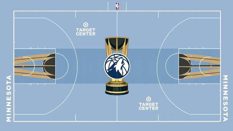
It’s something different. Some other teams are better but I kind of like it
curveballjesus
Looks like Memphis. Needs trees
HoopsJ
Are they gonna do cool courts for the NBA Finals? If they’re doing this stuff for the in-season tournament, I hope they go back to having the huge trophy on the court
FloweringSkull67
Would be better with trees, but I like that they are doing something different
KickerofTale
Should be renamed the “mid” season tournament, it’d be more on brand.
HowlAtchaBoy
This court will be much more watchable on TV than others. Well done
cayuts21
I’ve seen worse ones
yarn_install
I love the shade of blue, but it doesn’t really seem Wolves to me. Looks more like a Minneapolis Lakers throwback court.
Hypnosix
I don’t hate the idea here but I thought this was a bad fan photoshop until I saw it in the nba sub. They all look bad tho
porterhouse2588
I’ll be honest I hate all of these but I hate ours the least.
AffectionateBison942
That’s gonna be fun! Everyone always complaining
WrinkledRandyTravis
I think I reread the title of this like 6 times trying to find the joke I wasn’t getting, this is serious?
need2peeat218am
Too much visual distraction is going to take away from the game playing. Would like less in your face colors than this. Will have to see it live tho tbh.
Jacque_Hass
I like it, clean, wintry
Tillie_to_the_wolves
Would have been a nice court for our city jerseys a few years ago. Now idk, it doesn’t go with any of the teams colours. At least it doesn’t look like total shit like some of the other courts.

21 Comments
It’s something different. Some other teams are better but I kind of like it
Looks like Memphis. Needs trees
Are they gonna do cool courts for the NBA Finals? If they’re doing this stuff for the in-season tournament, I hope they go back to having the huge trophy on the court
Would be better with trees, but I like that they are doing something different
Should be renamed the “mid” season tournament, it’d be more on brand.
This court will be much more watchable on TV than others. Well done
I’ve seen worse ones
I love the shade of blue, but it doesn’t really seem Wolves to me. Looks more like a Minneapolis Lakers throwback court.
I don’t hate the idea here but I thought this was a bad fan photoshop until I saw it in the nba sub. They all look bad tho
I’ll be honest I hate all of these but I hate ours the least.
That’s gonna be fun! Everyone always complaining
I think I reread the title of this like 6 times trying to find the joke I wasn’t getting, this is serious?
Too much visual distraction is going to take away from the game playing. Would like less in your face colors than this. Will have to see it live tho tbh.
I like it, clean, wintry
Would have been a nice court for our city jerseys a few years ago. Now idk, it doesn’t go with any of the teams colours. At least it doesn’t look like total shit like some of the other courts.
I hope the city edition court looks a lot better.
It could be a lot worse:
[Indy](https://cdn.uni-watch.com/app/uploads/2023/10/F9spc_3XsAAGov8-scaled.jpeg)
[Suns](https://cdn.uni-watch.com/app/uploads/2023/10/F9sqQ5LW0AA4YF3-scaled.jpeg)
[Pels](https://cdn.uni-watch.com/app/uploads/2023/10/F9sp6CoWwAAnapW-1-scaled.jpeg)
Love it except the trophy in the middle behind the logo it would look fantastic without it
Ugly…
Looks like the teams didn’t get a lot of options. The only thing to me they got to pick was a logo or a word at center court.
I am sure this came from the league office. Because other then color and the logo they are all exactly the same.
you guys unironically have the most attractive looking color scheme
I really thought this was a joke