Looking at some of the other courts for the in-season tournament, I’m fine with this being bland
GormlessK
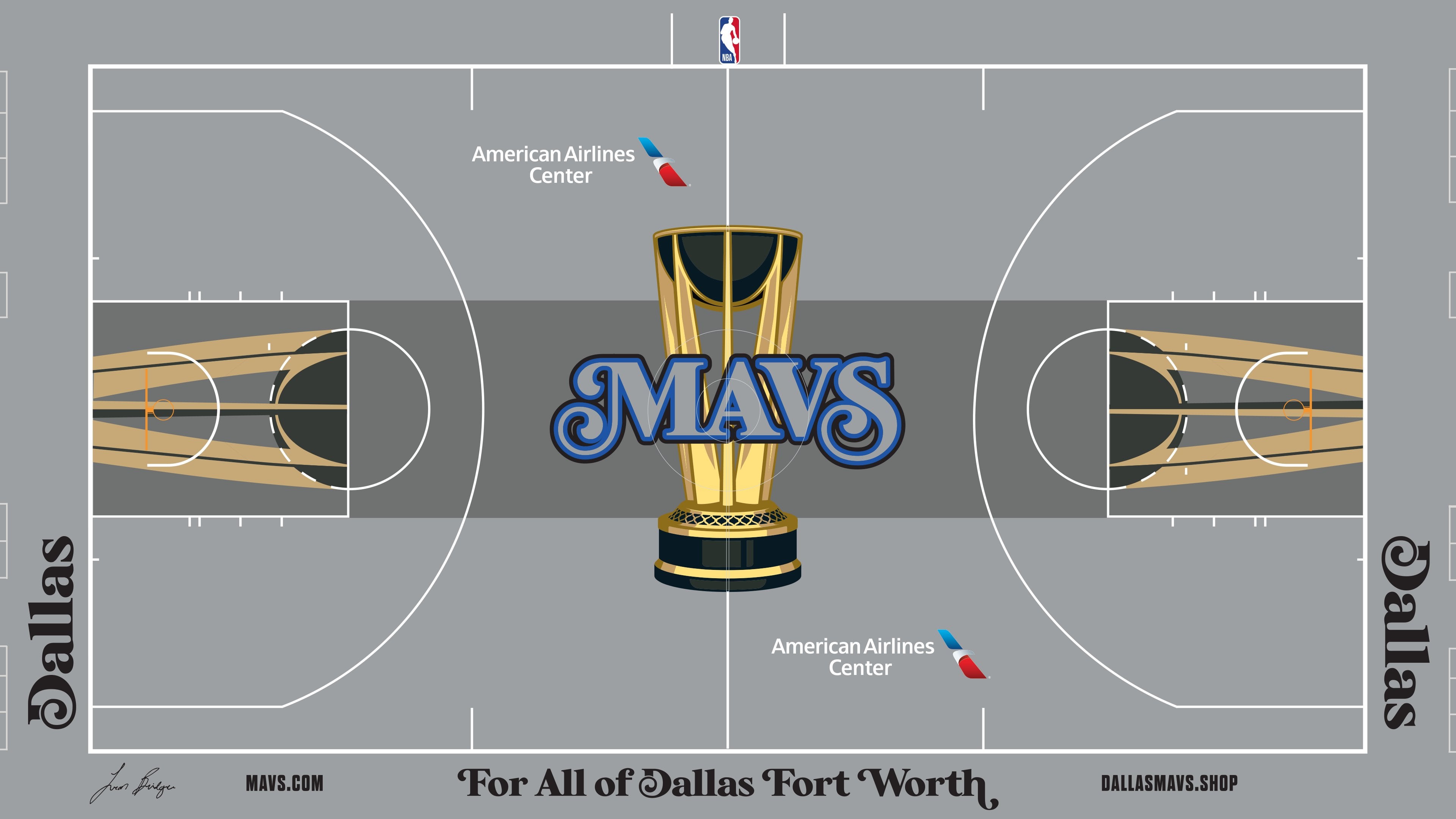
I feel like this could’ve been improved by just not having the middle trophy there? If you’re aiming for simple then you gotta at least commit to it.
roomtotheater
Ugly
NoWayNotThisAgain
For all of Dallas Fort Worth. Except Allen. Fuck those guys.
Kraudi
Did they use Paint to “design” it?
Mindfulmanners
Considering the Lakers and Bulls arena designs will be horrible to watch, this might actually work.
Yes it’s bland, but having a grey court won’t hurt my eyes as much.
IslandChillin
Trash all the way around
RedDwarf41
They are all bad. We really dodged a bullet looking at some other teams. Could have been blue or green. I don’t think any team has a good look. This is one of the least offensive.
enataca
Terribly plain which makes it the best of these abominations
WuKhann
Nope.
Kball4177
Why do the Mavs refuse to fully embrace the Green-Blue design?
aronnov
so does this game friday count towards the regular season win/loss for standings or no?
KvxMavs
Microsoft Paint looking shit
Why do we consistently have the most horrible designs…
melcolnik
This is the first time the Cavs have ever incorporated Ft. Worth into anything. As a FW Mavs fan I’m quite pleased, I just wish it weren’t all so damn ugly.
JMoy41
Ugly
LukasDog214
Only reason Fort Worth is mentioned is because this whole thing is a collab with Leon Bridges lol
fishystixxx007
I’ll wait till I see it live, hard to know how these colors will look once it’s applied to the floor. I agree, we are lucky looking at some of the other teams. That Mavs font is growing on me though 👀
Jcarter1632
Why? Shit is ugly. Why not just have the normal floor? Really dislike all painted solid basketball courts almost as much as I hate blue turf in football.
PraiseDirk
Uglier than the jerseys. Didn’t think it was possible.
Jon-Rambo
I’m ok with this compared to some of the other courts
Tuffwith2Fs
*when you start the project the night before it’s due*
heebs387
This definitely feels like someone forgot to do their homework the day before.
amlah6
At least it’s just for a game or two.
LackeyNo2
🔥🔥🔥
We’re finally honoring our trash bag jersey era.
CapitalFill4
I think the design is fine, but a navy court would’ve been cool. The nets have shown us that gray doesn’t look as good on TV as we (I) anticipated
MarlKarx-1818
Could you imagine if this tournament got rolled out when we had the graffiti jerseys? Neon green court. This is very mid but it could be worse
teslatiki
Where is the Dirk silhouette?
FelixtheSax
Wow, that’s… really bad
actual_yellow_bag
honestly I like the trophy paint design. The middle logo is weird though cause it looks like a 3d render. Will have to see it irl. I’m also in the minority and i kind of like the grey courts when they’re special and not used very often.
BrilliantLoli
That’s the worst court in history of courts, maybe ever.
jikae
Worst jerseys, worst court…
synyster-sounds
My least favorite part is that the logo looks like it’s in the dark. Why doesn’t it pop against something as boring as grey?


35 Comments
Wow
I think it’s unpleasant, too much gray.
Pretty bland, which is probably good
Looking at some of the other courts for the in-season tournament, I’m fine with this being bland
I feel like this could’ve been improved by just not having the middle trophy there? If you’re aiming for simple then you gotta at least commit to it.
Ugly
For all of Dallas Fort Worth. Except Allen. Fuck those guys.
Did they use Paint to “design” it?
Considering the Lakers and Bulls arena designs will be horrible to watch, this might actually work.
Yes it’s bland, but having a grey court won’t hurt my eyes as much.
Trash all the way around
They are all bad. We really dodged a bullet looking at some other teams. Could have been blue or green. I don’t think any team has a good look. This is one of the least offensive.
Terribly plain which makes it the best of these abominations
Nope.
Why do the Mavs refuse to fully embrace the Green-Blue design?
so does this game friday count towards the regular season win/loss for standings or no?
Microsoft Paint looking shit
Why do we consistently have the most horrible designs…
This is the first time the Cavs have ever incorporated Ft. Worth into anything. As a FW Mavs fan I’m quite pleased, I just wish it weren’t all so damn ugly.
Ugly
Only reason Fort Worth is mentioned is because this whole thing is a collab with Leon Bridges lol
I’ll wait till I see it live, hard to know how these colors will look once it’s applied to the floor. I agree, we are lucky looking at some of the other teams. That Mavs font is growing on me though 👀
Why? Shit is ugly. Why not just have the normal floor? Really dislike all painted solid basketball courts almost as much as I hate blue turf in football.
Uglier than the jerseys. Didn’t think it was possible.
I’m ok with this compared to some of the other courts
*when you start the project the night before it’s due*
This definitely feels like someone forgot to do their homework the day before.
At least it’s just for a game or two.
🔥🔥🔥
We’re finally honoring our trash bag jersey era.
I think the design is fine, but a navy court would’ve been cool. The nets have shown us that gray doesn’t look as good on TV as we (I) anticipated
Could you imagine if this tournament got rolled out when we had the graffiti jerseys? Neon green court. This is very mid but it could be worse
Where is the Dirk silhouette?
Wow, that’s… really bad
honestly I like the trophy paint design. The middle logo is weird though cause it looks like a 3d render. Will have to see it irl. I’m also in the minority and i kind of like the grey courts when they’re special and not used very often.
That’s the worst court in history of courts, maybe ever.
Worst jerseys, worst court…
My least favorite part is that the logo looks like it’s in the dark. Why doesn’t it pop against something as boring as grey?