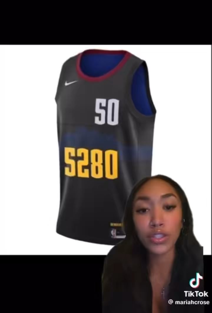
That’s what I just said. In bright massive yellow across the stomach is FOUR NUMBERS.
“Everybody welcome to the floor number 5280-50 Aaron Gordon.”
Bovine_Joni_Himself
Definitely my least favorite Nuggets jersey of all time. Why are there so many numbers? Why does the color scheme have such a corporate lease aesthetic?
After winning the finals I was ready to buy whatever shit Nike released but…. I don’t think I can get there with this. Maybe it’ll look better in a full kit.
runevault
At most the 5280 should be as big as the nike logo on the right strap. Mind you I’m not sure doing that saves this jersey but at least it would look better than it does now.
Jonweasly14
I think they fire
BoneyardBill
These are not good but still are better than the baby blue,
pdrlives
Basura!
panchettaz
I hate the font of the 2, it looks weird
wombat660
terrible.
Pooperism
All of the city jerseys are shit, Nike needs to lose the deal cuz they suck ass. Home whites, away color, and maybe a throwback for like 10 games a year, not two new jerseys every year, its awful
Burn_the_duster_
I am so sick of Nike ruining NBA jerseys. But hey at least they’re not red?
Pandiosity_24601
This bad boy can fit so many numbers
phil42ip
Because it is unconventional is the reason to like it. Hackneyed design constructs become tired, much like her explanation…ya feel me?
mares8
So ugly. Even putting those numbers on jersey is embarrassing. Many are complaining about Nike jerseys but our might be worst now.
Its also ugly without stupid numbers
Abiv23
Nike has been terrible with jersey design
Bring back the Adidas kits
Bobby_Trollguin
I was so ready to jump into new gear, but this is a hard pass.
bigwillystyle93
Josh Kroenke went on the DNVR pod and they briefly talked about the jerseys and Nike. I got the sense that Nike has a much bigger hand in the the Jersey decisions than we would expect, and there are a lot of bullshit rules around what we can and can’t do. To the point where even Josh, the owner of the team, can’t do what he wants with the jersey/branding. I found it really interesting.
Glittering_Let_4230
The thing that is most annoying for me is that 5280 is not even that high of altitude. It’s ridiculous to think professional athletes can’t adjust to a slight elevation gain. And to say the Nuggets win home games because of it. So stupid. It is just the most lazy corporate lingo written by people who obviously know nothing about Denver. Salt Lake City is 4000 ft. Even Phoenix is at 1000 ft. It’s not like they are playing on top of a 14er.
Well as a numbers guy I approve of this Jersey. Everything around us is mathematics and can be described in numbers. I’m guessing that “5280” is a way to put the “mile high city” in numbers. Be happy they did not convert “5280” into binary. Then this jersey would have something like a 14-15 digit number on it 😀
iAmAMileHigh
I feel like this jersey would be such a hit if they just got rid of the numbers and changed the blue mountains on the jersey to yellow instead.
Leaf_Atomico
I wish I could somehow break into the jersey design scene – I would make such a dope jersey for us.
Virtual-Ostrich8908
Gray? C’mon man
Shenanigans80h
Idk how they thought these would be met with praise. The dark blue is barely visible on the charcoal, the numbers make it cluttered, and the one red cuff around the neck looks silly as fuck. Nothing about this screams Denver or Nuggets, other than the “google in the middle of night” ass 5280 someone slapped on there to make it seem local. Amateur hour.
ScrewuGuysImGoingHme
People shouldnt be offended when people says this jersey is trash it’s a reflection on Nike more then the team


25 Comments
Not the all-time worst, but certainly not good
That’s what I just said. In bright massive yellow across the stomach is FOUR NUMBERS.
“Everybody welcome to the floor number 5280-50 Aaron Gordon.”
Definitely my least favorite Nuggets jersey of all time. Why are there so many numbers? Why does the color scheme have such a corporate lease aesthetic?
After winning the finals I was ready to buy whatever shit Nike released but…. I don’t think I can get there with this. Maybe it’ll look better in a full kit.
At most the 5280 should be as big as the nike logo on the right strap. Mind you I’m not sure doing that saves this jersey but at least it would look better than it does now.
I think they fire
These are not good but still are better than the baby blue,
Basura!
I hate the font of the 2, it looks weird
terrible.
All of the city jerseys are shit, Nike needs to lose the deal cuz they suck ass. Home whites, away color, and maybe a throwback for like 10 games a year, not two new jerseys every year, its awful
I am so sick of Nike ruining NBA jerseys. But hey at least they’re not red?
This bad boy can fit so many numbers
Because it is unconventional is the reason to like it. Hackneyed design constructs become tired, much like her explanation…ya feel me?
So ugly. Even putting those numbers on jersey is embarrassing. Many are complaining about Nike jerseys but our might be worst now.
Its also ugly without stupid numbers
Nike has been terrible with jersey design
Bring back the Adidas kits
I was so ready to jump into new gear, but this is a hard pass.
Josh Kroenke went on the DNVR pod and they briefly talked about the jerseys and Nike. I got the sense that Nike has a much bigger hand in the the Jersey decisions than we would expect, and there are a lot of bullshit rules around what we can and can’t do. To the point where even Josh, the owner of the team, can’t do what he wants with the jersey/branding. I found it really interesting.
The thing that is most annoying for me is that 5280 is not even that high of altitude. It’s ridiculous to think professional athletes can’t adjust to a slight elevation gain. And to say the Nuggets win home games because of it. So stupid. It is just the most lazy corporate lingo written by people who obviously know nothing about Denver.
Salt Lake City is 4000 ft. Even Phoenix is at 1000 ft. It’s not like they are playing on top of a 14er.
Tangentially related, is it still possible to get the black jerseys with the rainbow stripes like the one pictured [here](https://bingjerseys.co/Nike-Nuggets-15-Nikola-Jokic-Mens-2023-NBA-Finals-Champions-Black-City-Edition-Jersey.html?msclkid=3da9285c2d32145086cc4d1fe4226f19)? I can’t find them at any official sellers.
Well as a numbers guy I approve of this Jersey. Everything around us is mathematics and can be described in numbers. I’m guessing that “5280” is a way to put the “mile high city” in numbers. Be happy they did not convert “5280” into binary. Then this jersey would have something like a 14-15 digit number on it 😀
I feel like this jersey would be such a hit if they just got rid of the numbers and changed the blue mountains on the jersey to yellow instead.
I wish I could somehow break into the jersey design scene – I would make such a dope jersey for us.
Gray? C’mon man
Idk how they thought these would be met with praise. The dark blue is barely visible on the charcoal, the numbers make it cluttered, and the one red cuff around the neck looks silly as fuck. Nothing about this screams Denver or Nuggets, other than the “google in the middle of night” ass 5280 someone slapped on there to make it seem local. Amateur hour.
People shouldnt be offended when people says this jersey is trash it’s a reflection on Nike more then the team