https://x.com/utahjazz/status/1798052097398870189?s=46&t=aZWMWvt5zedw_hhbFsLkfA
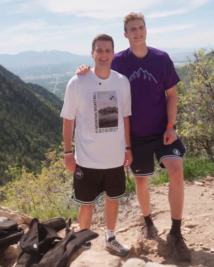
Notice Lauri’s shirt. Those mountains do not match the profile of the old mountains jersey logos. That is going to be in the new design.
by Rub-Such

https://x.com/utahjazz/status/1798052097398870189?s=46&t=aZWMWvt5zedw_hhbFsLkfA
Notice Lauri’s shirt. Those mountains do not match the profile of the old mountains jersey logos. That is going to be in the new design.
by Rub-Such
4 Comments
Hardy is such a nerd. I love it
They look much more “Utah” than previous editions.
Purple and sunset, that’s all that I ask for in a rebrand
I’m not sure if I have ever seen a 5 peaked mountain logo. They usually have 7. Both the ’96 and last years city edition had 7 peaks. Definitely the same Shadow design but with less peaks.
https://preview.redd.it/xf8odepqyl4d1.jpeg?width=841&format=pjpg&auto=webp&s=f360be11a93a75341cbdedf9623332e46c76aadc