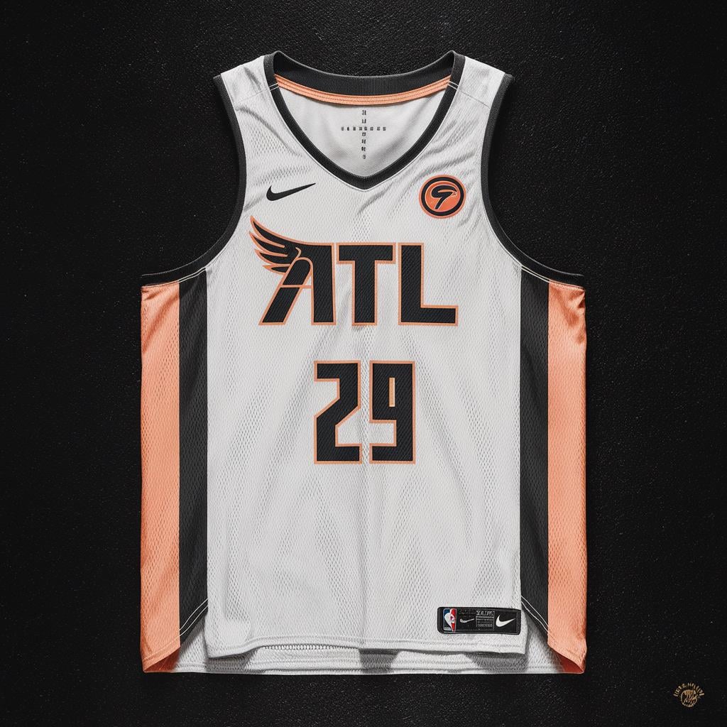
Atlanta Hawks rebrand concept #2. Wanted to incorporate peach in the color scheme and also actually put hawk symbolism on the jersey. Let me know what you think…
Atlanta Hawks rebrand concept #2. Wanted to incorporate peach in the color scheme and also actually put hawk symbolism on the jersey. Let me know what you think…
Don’t love the peach color because it’s not a very tough looking color but this design is sharp! Wonder if you can find a way to integrate a beak or something from the pacman into it
EarthDwellr
Clean
Masterchiefy10
I like the single wing way more that the double old school one…


3 Comments
Don’t love the peach color because it’s not a very tough looking color but this design is sharp! Wonder if you can find a way to integrate a beak or something from the pacman into it
Clean
I like the single wing way more that the double old school one…
Nice job!