I hope we turn back to these + the jerseys from then
gleeson630
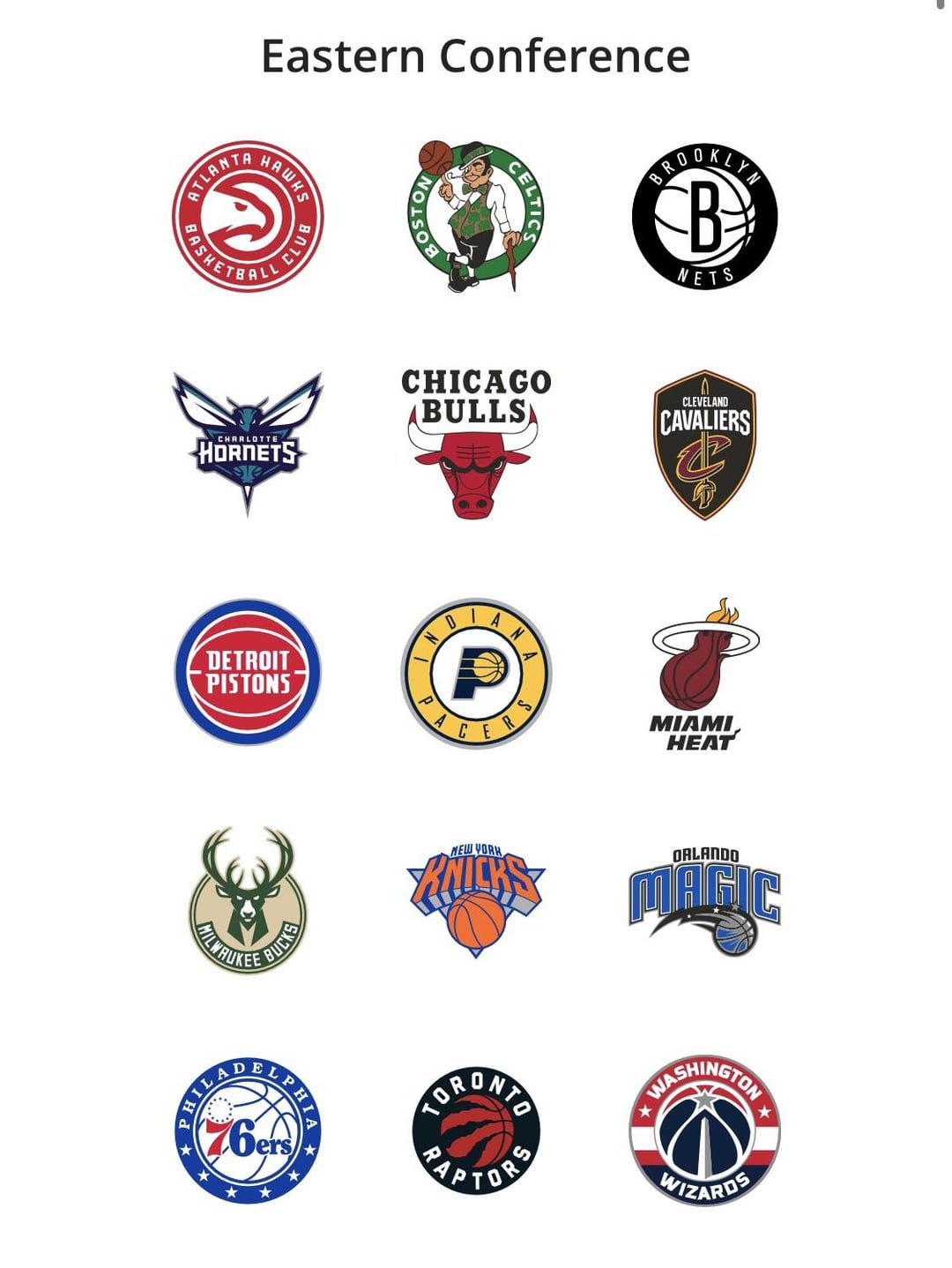
Do we really need more circles?
OmniSzron
Good direction. The shield never did it for me. It was a bit of a holdover from the NJ Nets days, but the way the type was stretched to fit inside, and the absolute lack of padding made it look cramped and amateurish. The circle logo on the other hand always looked more balanced.
They updated the circle to be a little more flat and legible which is also a welcome addition. Is it the best logo in the league? No, but it’s clean and recognizable + looks good on merch and that’s about as much as you can expect from a logo.
Also, the new Nets script logotype will probably debut this season and that one is sensational.

10 Comments
A welcome change. I like it.
Its slightly better. Still want a complete refresh on branding (keep the color scheme though)
Ngl I’m not sure the purpose of this update lol
I actually prefer new york on the bottom of the first image instead of nets. It feels like a lot of space left over on the bottom.
https://preview.redd.it/ill2bi5g6zad1.jpeg?width=1170&format=pjpg&auto=webp&s=e507258965c15bc4c5f6833b06b3e8e331e9708c
I hope we turn back to these + the jerseys from then
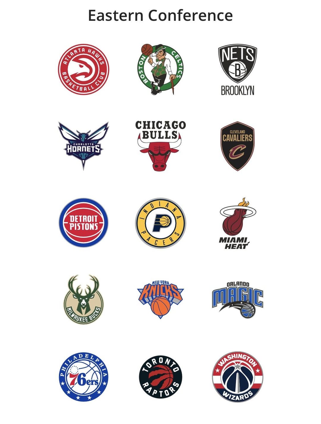
Do we really need more circles?
Good direction. The shield never did it for me. It was a bit of a holdover from the NJ Nets days, but the way the type was stretched to fit inside, and the absolute lack of padding made it look cramped and amateurish. The circle logo on the other hand always looked more balanced.
They updated the circle to be a little more flat and legible which is also a welcome addition. Is it the best logo in the league? No, but it’s clean and recognizable + looks good on merch and that’s about as much as you can expect from a logo.
Also, the new Nets script logotype will probably debut this season and that one is sensational.
https://preview.redd.it/q0d172qlizad1.jpeg?width=510&format=pjpg&auto=webp&s=bbe040ae0c2bf9e8a05cd082a0a255a7df7c3949
I’ve always liked this logo better. It was used on merch a lot soon after the move but then they moved away from it.
They stole the sword from the Cavs. Can’t have shit in Cleveland
Go back to the original court please