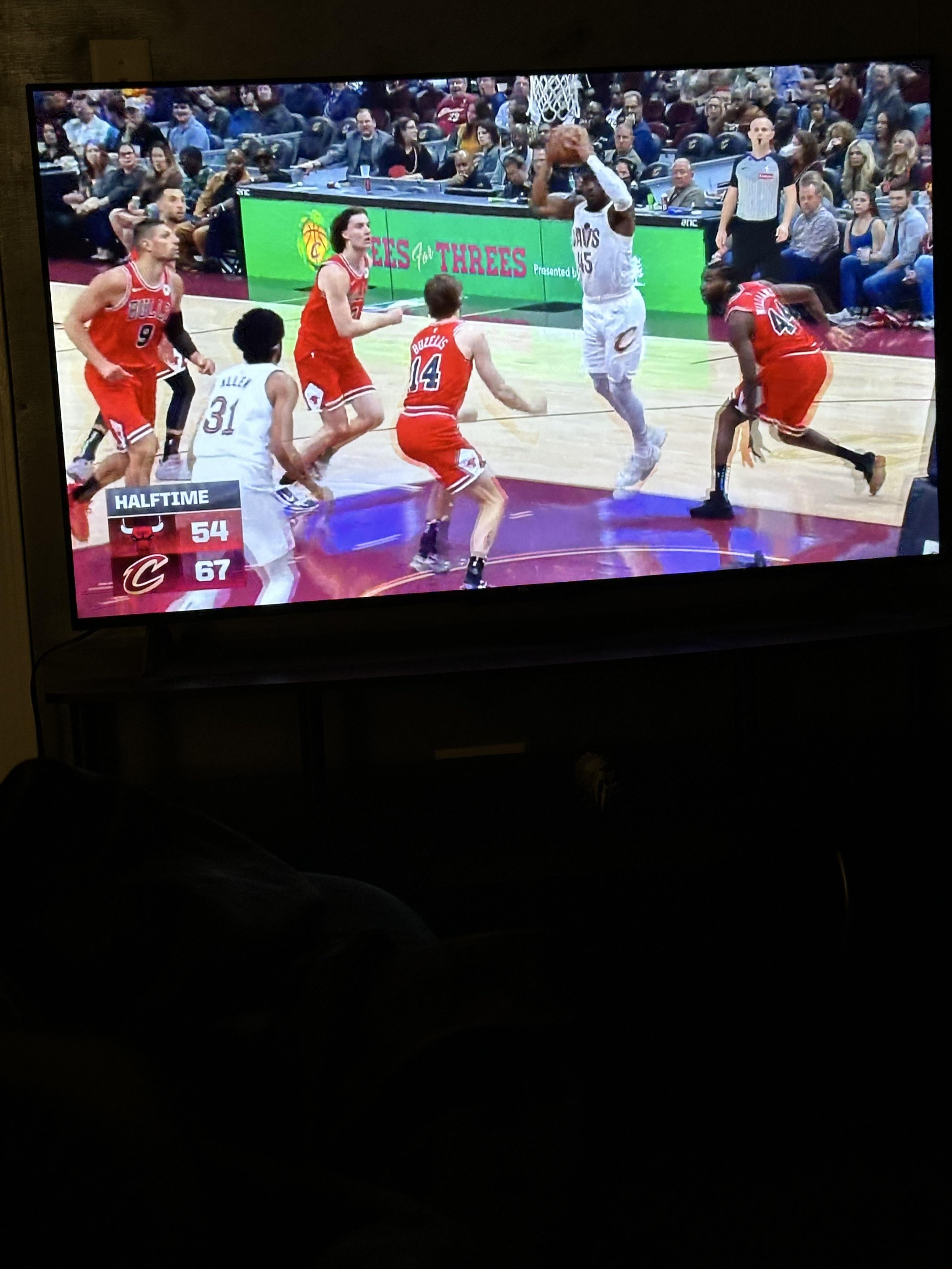
Graphic design is actually my passion, so seeing bad graphic design pisses me off deeply. Here’s how you fix it.
1) this is the graphic used right before commercials. Move this to the right and make it a bit smaller
2) add timeouts under the team logos
3) in that gray space add the time, shot clock and quarter
4) graphics that would normally be from the side or bottom, aka “Coby White 21 points,” come from the left side of the scorebug
5) profit.
Send this to their twitter or something idk, however we can reach them.
by alexsolren


2 Comments
please this.
absolutely bizarre design choice. it’s truly hard to watch the game. i’d rather there be a fly buzzing around the screen than whatever the hell that was.
Yea wait a second it’s so crazy that they have this GOOD version of the scorebug that they choose to not use