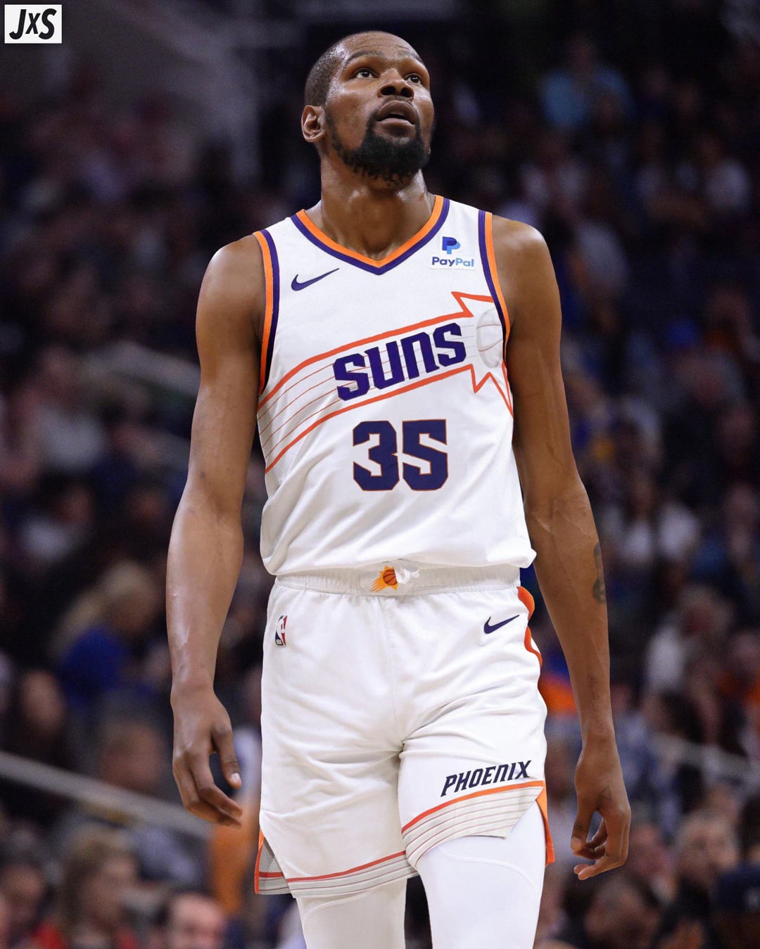
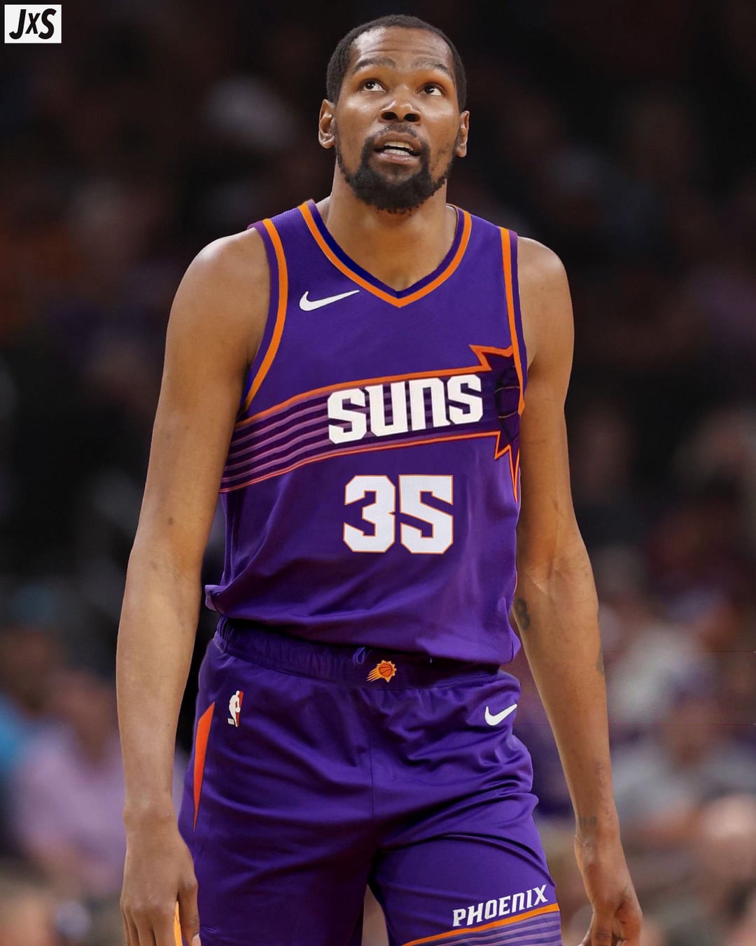
I can not begin to describe how atrocious these jerseys are.
cantmakeusernames
I think the white looks really good, and the purple is just a bad edit that makes KD look frumpy lol
edit: to be clear I think they look better than our current jerseys, but I’ve always thought we should have the coolest jerseys in the league and these are still missing some flair
480AHole
They are ok, not great. That said, they are better than the current Icon and Association sets. The Statement and Classics are the only ones I like in the current rotation.
bighairyturd
Better than current icon/associations but also what’s so hard about just using a slightly modernized version of the orginial sunburst with same colors. Making it the same color as the jersey just makes it look like a cheap Walmart knockoff.
bdm016
Lol I wish we could stick with the same jerseys. I like the valley, current purple sun bolt, and turquoise jerseys
T-Weed-
I kinda like the font on the numbers but the rest is trash
CactusHooping
I could get used to the white,purple would take longer though. 😂
dasecondcomin2
We need to just use the valley jersey designs. At least have them inspired by them if not exactly the same.
Lumpy-Deer1578
ah man i like these a lot idk why lol
MontezumaMike
Bring back the 95 style
UnusedTimeout
They’ll look better on the court than in the concepts, but still look like practice jerseys
Secret-Top3200
Looks like some half-done fan jersey. Hope these don’t end up being real or the final.
snakepunk
I kinda dig em. I certainly think the white looks better than our current ones.
prematurely_bald
Seems like they added some good individual elements, but the effect is minimized by scrunching everything together. It’s just blah.
SevenHunnet3Hi5s
they just look.. awkward? like the sun stripe is just so small along with the wordmark aswell. and the number font is so out of place. the idea of it is great (i mean cmon the barkley jerseys are one of the most idonic ever) but the execution just falls flat here
Vikings480
Hard. Fucking. Pass.
Background-Meat3011
The word should’ve been kept above the burst
sunsluvr
These are ugly.
dorkfaceclown
Hell no. Our current jerseys are better than these. Anyone that says otherwise is sus.


20 Comments
I can not begin to describe how atrocious these jerseys are.
I think the white looks really good, and the purple is just a bad edit that makes KD look frumpy lol
edit: to be clear I think they look better than our current jerseys, but I’ve always thought we should have the coolest jerseys in the league and these are still missing some flair
They are ok, not great.
That said, they are better than the current Icon and Association sets.
The Statement and Classics are the only ones I like in the current rotation.
Better than current icon/associations but also what’s so hard about just using a slightly modernized version of the orginial sunburst with same colors. Making it the same color as the jersey just makes it look like a cheap Walmart knockoff.
Lol I wish we could stick with the same jerseys. I like the valley, current purple sun bolt, and turquoise jerseys
I kinda like the font on the numbers but the rest is trash
I could get used to the white,purple would take longer though. 😂
We need to just use the valley jersey designs. At least have them inspired by them if not exactly the same.
ah man i like these a lot idk why lol
Bring back the 95 style
They’ll look better on the court than in the concepts, but still look like practice jerseys
Looks like some half-done fan jersey. Hope these don’t end up being real or the final.
I kinda dig em. I certainly think the white looks better than our current ones.
Seems like they added some good individual elements, but the effect is minimized by scrunching everything together. It’s just blah.
they just look.. awkward? like the sun stripe is just so small along with the wordmark aswell. and the number font is so out of place. the idea of it is great (i mean cmon the barkley jerseys are one of the most idonic ever) but the execution just falls flat here
Hard. Fucking. Pass.
The word should’ve been kept above the burst
These are ugly.
Hell no. Our current jerseys are better than these. Anyone that says otherwise is sus.
Trash