Hi y’all! Since the season’s over (sadly), the subreddit’s been talking possible rebranding ideas and that got me excited so I decided to share my take on it.
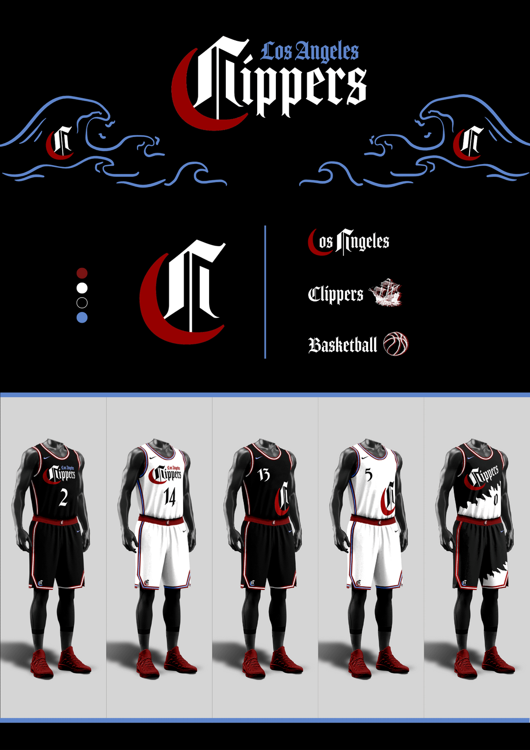
Since the Lakers have a hold on being the more flashy, Hollywood team in LA, I figured we could lean into the underdog reputation and opt for a more edgy, clean look instead.
I really like what they did with the graffiti/blackletter ‘Los Angeles’ on the current statement and previous city jerseys since it celebrates LA’s street culture so this was definitely inspired by that.
I wanted to include the San Diego heritage as well so this is my attempt of incorporating the shape of a boat and a rough basketball outline into a logo, while also having it subtly resemble the letters ‘LA’.
Initially, I made the version with red/black/white but thought it might be too similar a colorway to what the Bulls have so I made a version with a splash of that light blue from the blue/orange jerseys.
Anyway, I had a lot of fun working on this and would appreciate any feedback so let me know what you think! 🙂
Cezonky
This goes hard. I’d buy one for sure!
LibraRomance
🤬👎As a Clippers fan since 1985 and a season ticket holder. This is horrible!
Saydowski
Daaamnnn that is beautiful. I truly hope the organization does something like this
Guyzea
Clippervania
Opposite-Journalist6
Love this!
shibby5000
Crippers!
DoubleYuB
hate the blue and red on the taping, those colours clash horribly for me. id keep the deeper blue, especially if you’re going for a deeper red. rest looks sick tho


8 Comments
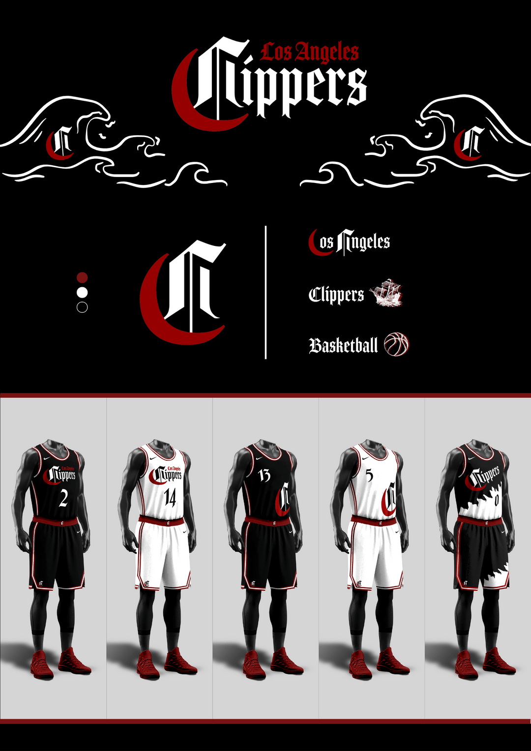
Hi y’all! Since the season’s over (sadly), the subreddit’s been talking possible rebranding ideas and that got me excited so I decided to share my take on it.
Since the Lakers have a hold on being the more flashy, Hollywood team in LA, I figured we could lean into the underdog reputation and opt for a more edgy, clean look instead.
I really like what they did with the graffiti/blackletter ‘Los Angeles’ on the current statement and previous city jerseys since it celebrates LA’s street culture so this was definitely inspired by that.
I wanted to include the San Diego heritage as well so this is my attempt of incorporating the shape of a boat and a rough basketball outline into a logo, while also having it subtly resemble the letters ‘LA’.
Initially, I made the version with red/black/white but thought it might be too similar a colorway to what the Bulls have so I made a version with a splash of that light blue from the blue/orange jerseys.
Anyway, I had a lot of fun working on this and would appreciate any feedback so let me know what you think! 🙂
This goes hard. I’d buy one for sure!
🤬👎As a Clippers fan since 1985 and a season ticket holder. This is horrible!
Daaamnnn that is beautiful. I truly hope the organization does something like this
Clippervania
Love this!
Crippers!
hate the blue and red on the taping, those colours clash horribly for me. id keep the deeper blue, especially if you’re going for a deeper red. rest looks sick tho