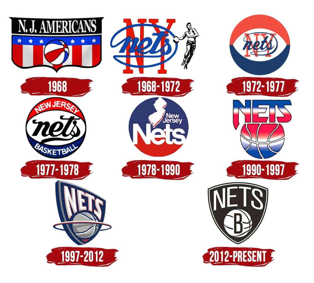
Favorite Logo in Nets History? by Kwilly462 Atlantic DivisionBrooklyn NetsEastern Conference Prev Post Am I the only one who didn’t know Champagnie was with the Celtics now? May 24, 2023 Next Post Boston Celtics vs Miami Heat Full Game 4 Highlights | 2022-23 NBA Playoffs May 24, 2023 22 Comments CaptainCool04 1 year ago 97-12 hands down gside876 1 year ago 97-12 easily wins humble_Rufus 1 year ago 97-12 j_cruise 1 year ago 2012 and 1990 jkraus150 1 year ago 1997-2012 IronRevenge131 1 year ago 90-97 discographyA 1 year ago Not sure I’d say favorite but I’d take some retro gear with the 72-77 look. Lao_xo 1 year ago The only wrong answer is 1968 lol. 2012 is timeless but I like the 77 and 97 ones too. GelloJive 1 year ago Hard to explain but I like the 78 logo. And of course 2012! ReadingThen4732 1 year ago 1990-97 logo and the current Black & White BKtoDuval 1 year ago the last two for sure. and the third and fourth ones are cool Kenny_Heisman 1 year ago ngl they all suck dburge22 1 year ago The Drazen Petrovic and Mookie Blaylock logo thatoneguyD13 1 year ago The modern logo is great, honestly. Big fan regemusic33 1 year ago Love the one that actually alludes to the state killerchao93 1 year ago Modern logo but the 1990-1997 is a real classic SabresMakeMeDrink 1 year ago 90-97Makes me think of sugary cereal and the 1992 X-Men TV cartoonJust an overall vibe celularfeel 1 year ago 78-90 and 90-97 are both very good ChefBoyAnde728 1 year ago 90-12 Philly_20Clip 1 year ago Shesh, we’ve had some blah logos. Current is best, I guess. MrMoistandDelicious 1 year ago 97, the should rename to NY Nets though H0wSw33tItIs 1 year ago 90-97 always looked like one of the popsicles you can get from the ice cream truck. not a serious logo, y’all.Write A CommentYou must be logged in to post a comment.
Lao_xo 1 year ago The only wrong answer is 1968 lol. 2012 is timeless but I like the 77 and 97 ones too.
SabresMakeMeDrink 1 year ago 90-97Makes me think of sugary cereal and the 1992 X-Men TV cartoonJust an overall vibe
H0wSw33tItIs 1 year ago 90-97 always looked like one of the popsicles you can get from the ice cream truck. not a serious logo, y’all.


22 Comments
97-12 hands down
97-12 easily wins
97-12
2012 and 1990
1997-2012
90-97
Not sure I’d say favorite but I’d take some retro gear with the 72-77 look.
The only wrong answer is 1968 lol. 2012 is timeless but I like the 77 and 97 ones too.
Hard to explain but I like the 78 logo. And of course 2012!
1990-97 logo and the current Black & White
the last two for sure. and the third and fourth ones are cool
ngl they all suck
The Drazen Petrovic and Mookie Blaylock logo
The modern logo is great, honestly. Big fan
Love the one that actually alludes to the state
Modern logo but the 1990-1997 is a real classic
90-97
Makes me think of sugary cereal and the 1992 X-Men TV cartoon
Just an overall vibe
78-90 and 90-97 are both very good
90-12
Shesh, we’ve had some blah logos. Current is best, I guess.
97, the should rename to NY Nets though
90-97 always looked like one of the popsicles you can get from the ice cream truck. not a serious logo, y’all.