Alright now give us a New Jersey besides tha Mardi gras one
CurvaceousTopG
The more and more I look at our jerseys I actually like them, but I still think we need new ones tbh, I like the font and lettering, but I feel like some of the designs around the edges are just meh, and we definitely need some new colors and I’m kinda tired of Mardi Gras jerseys , I wish they did a throwback to the hornets with blue and yellow and the old lettering, but kept it saying the pelicans.
JayDogon504
Massive changes
lambquentin
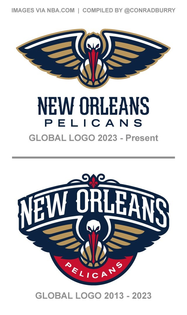
I actually don’t like this change. The former logo had everything included in it as one piece. It looked great while doing so which isn’t an easy task (L.A. Rams and the Chargers logo for those that want a recent example of a bad one). Plus it includes more red that helps balance the weight of the color. A color that has been shown to be a favorite uniform for us to wear.
The new one just seems like it’s two separate pieces placed next to each other. It’s not bad but it just doesn’t feel as New Orleans to me. It’s more corporate and less red beans and rice on a Monday.


4 Comments
Alright now give us a New Jersey besides tha Mardi gras one
The more and more I look at our jerseys I actually like them, but I still think we need new ones tbh, I like the font and lettering, but I feel like some of the designs around the edges are just meh, and we definitely need some new colors and I’m kinda tired of Mardi Gras jerseys , I wish they did a throwback to the hornets with blue and yellow and the old lettering, but kept it saying the pelicans.
Massive changes
I actually don’t like this change. The former logo had everything included in it as one piece. It looked great while doing so which isn’t an easy task (L.A. Rams and the Chargers logo for those that want a recent example of a bad one). Plus it includes more red that helps balance the weight of the color. A color that has been shown to be a favorite uniform for us to wear.
The new one just seems like it’s two separate pieces placed next to each other. It’s not bad but it just doesn’t feel as New Orleans to me. It’s more corporate and less red beans and rice on a Monday.
TL;DR: Not On Herb.