
Hello Raptors fans!
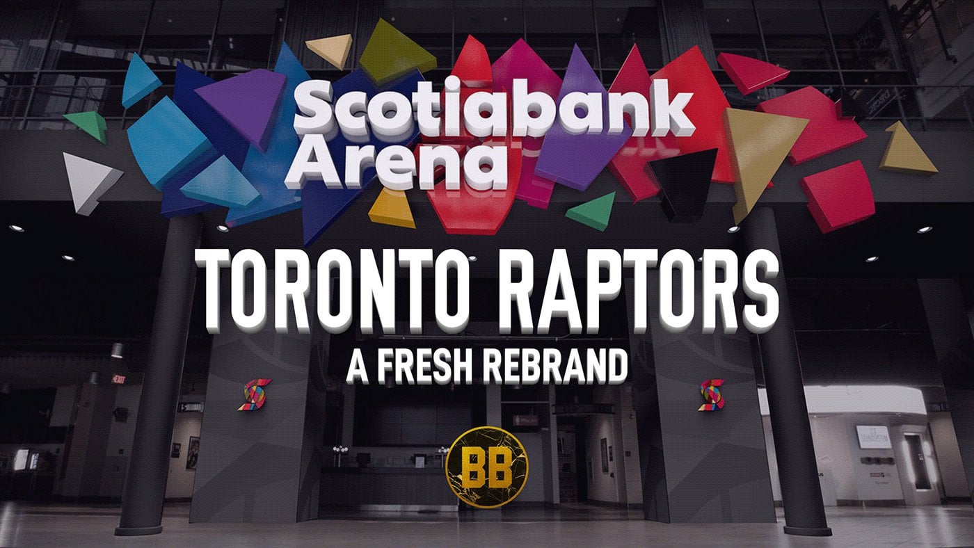
I decided to make a simple [concept](https://www.behance.net/gallery/176870023/Toronto-Raptors-Rebrand) about rebranding the Toronto Raptors. Been working on it for many days. Many of the designs and elements are incorporated from my previous concepts in this sub ([Part 1](https://www.reddit.com/r/torontoraptors/comments/xt1ytr/part_1_raptors_jersey_concepts_made_by_me/) and [Part 2](https://www.reddit.com/r/torontoraptors/comments/xyvta1/part_2_raptors_jersey_concepts/)). I appreciate any feedback or comments that you may have.
​
\*PS: Tried to post the images here but could not due to the limit.
​
by DrKLowry


14 Comments
The logo is awful, the purple ball, font and circle isn’t visually appealing to me.
Your Toronto flag and Dino jerseys are great. Would love to see those
Those Husky jerseys are fiiiiiire
I love the Dino jerseys but the Dino humping the ball was a travesty in 95 and it remains one.
As some have said, I’m not a big fan of the logo but those jerseys are fire. They need to use these
The centre court logo is way too big.
Toronto flag jersey is long overdue
I would love to ditch the Drake-inspired “City” jerseys for some proper jerseys that *actually* represent the city. Black and gold looks cool, but the city’s colours are blue and white.
You clearly put a lot of effort in this, great job.
I love the jerseys, they’re fire, they’re awesome.
The court’s pretty cool, merchandise is fire, all of that stuff is great.
The only hair in the soup is the logo, honestly not a fan of it. I feel we could do better than that logo.
Everything else is great.
Imo if we’re using a modified version of the throwback jersey, it’d be wise to also use a modified version of the throwback logo. Matches the whole theme better.
Looks good, on brand and a nice mix of old and new.
I love the logo but not too much of a fan of the purple colouring of the ball. All of the jerseys are great but the black and gold city jersey and black and gold court look goofy. I think it’s the claw marks looking cheap. The husky court is cute and thank God you didn’t include chevrons lmao
Did you put those in NBA 2k23?
I am using a very similar uniform design that I found in the vault. Updated old dino unis. I love them.
I am a simple man. I see more purple for the Raptors and I upvote.
The Canada jersey is WAY too Torontonian. There’s nothing Canada about it besides that it’s red.
I would like the word “Raptors” in the shape of a basketball or just the black claw marks on the jersey.