I read all your comments and worked on several things (cleaning up the lettering, experimenting with different color schemes, MORE BLUE) and I look forward to hearing what you guys think.
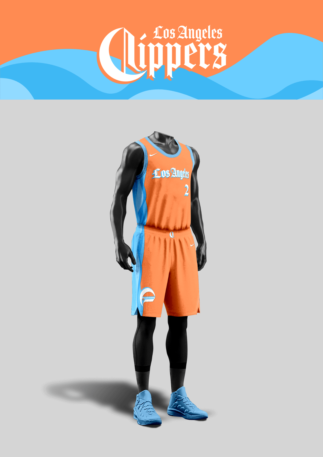
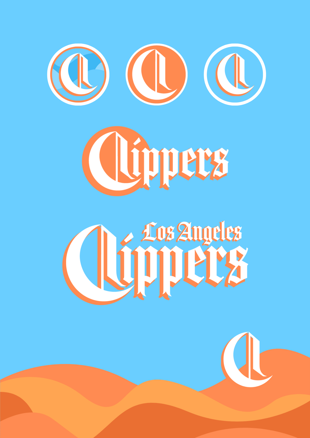
For the classic jerseys, I kept the original designs from the first post and for the alt ones, I tried to work in some waves along the side panel with the “C” logo as a little ship sailing along it.
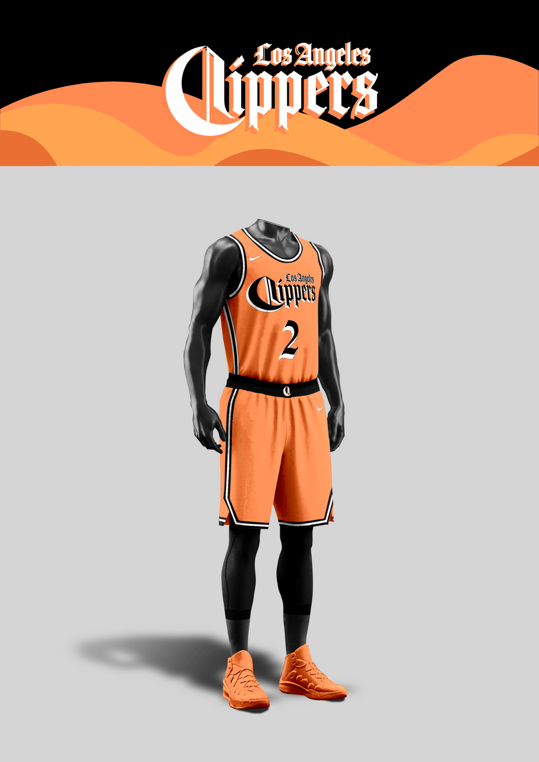
Colors-wise, I steered away from the red-black-white combo and made versions with the iconic colors from the previous eras, ranging from red-blue of Lob City, baby blue-orange of the San Diego Clippers, and the black-orange-white of the Buffalo Braves.
Overall, I’m leaning slightly towards the baby blue & orange but I’m curious to see what you guys think! I had a lot of fun working on this again and I look forward to hearing any kind of feedback 🙂
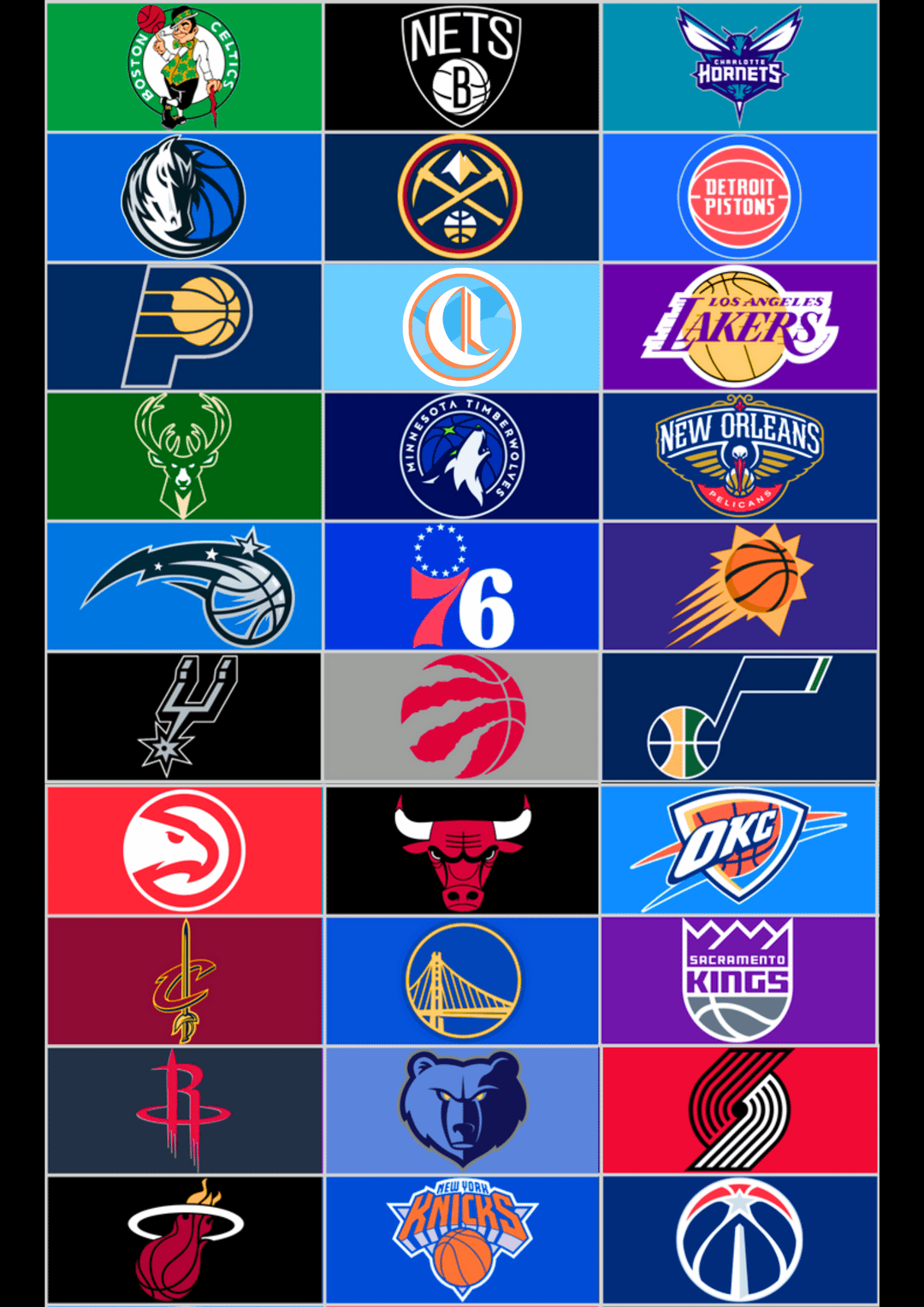
P.s. I included the last slide because I wanted to see how the colors and logo would stack up against the other teams, because I’m worried it might look a little too light and minimalistic, so any thoughts on that would be appreciated as well!
PPDonuts
That orange & black combo go pretty hard..
thahovster7

JayFrmLB
Ahhh red jerseys… I’ll take three please
SevenHunnet3Hi5s
love it. so much more fresh than the last one i think it captures LA a lot better. my only thing though is i’d like to see the triangle sail design somewhere like on the shorts
benificialart
I dont like the black and Orange reminds me of the suns too much
johnobmas
I love the black and orange jerseys, feels like Halloween lol
digitalme
I am so ready to ditch the blue/red/white color scheme since so many teams in the NBA use them. Remove the logos and they just look like sixers/detroit/etc. I LOVE the other colors you went with and would love for those to be our primary ones. And of course our new ownership loves black jerseys so that would have to be an alt color too. Good work man, I hope we switch it up once we get to the dome.
Same-Schedule-6011
You can repackage, rebrand, revise, turn it upside down, spin it sideways, and they will always be the same piece of dog shit!


9 Comments
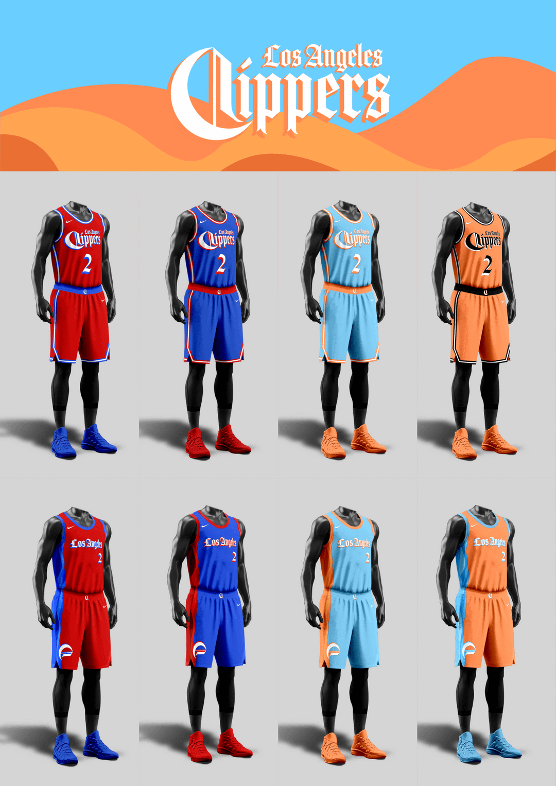
Hi y’all, I’m back again with a refresh on my Clippers rebrand concept!
Here’s the link to the first one if you missed it:
[https://www.reddit.com/r/LAClippers/comments/13dsrv2/im_procrastinating_work_so_heres_my_take_on_a/?utm_source=share&utm_medium=web2x&context=3](https://www.reddit.com/r/LAClippers/comments/13dsrv2/im_procrastinating_work_so_heres_my_take_on_a/?utm_source=share&utm_medium=web2x&context=3)
I read all your comments and worked on several things (cleaning up the lettering, experimenting with different color schemes, MORE BLUE) and I look forward to hearing what you guys think.
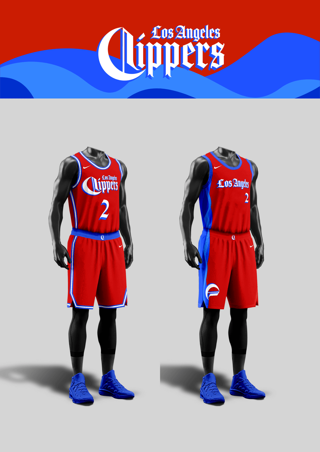
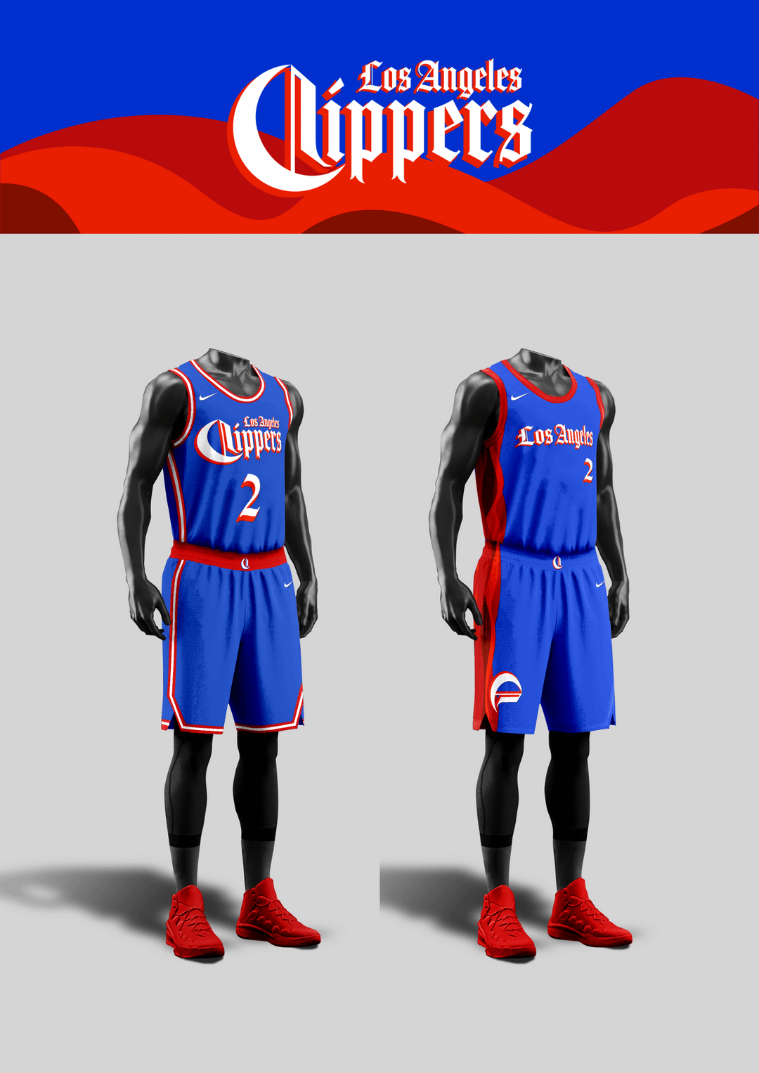
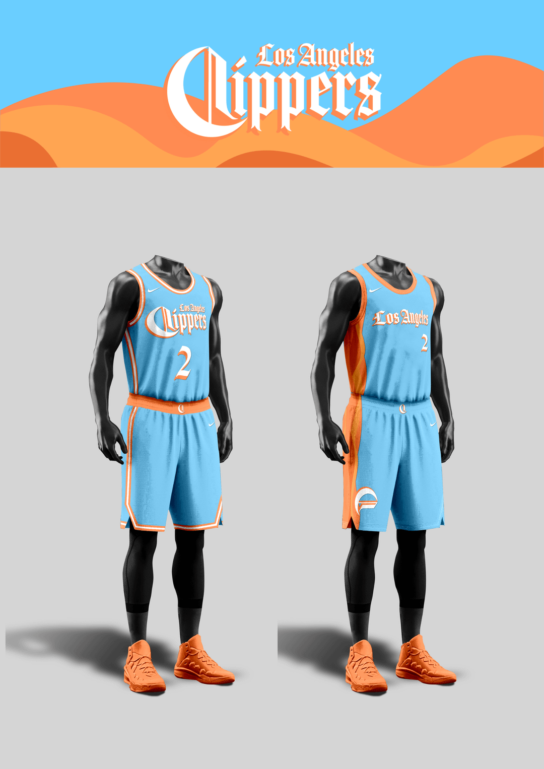
For the classic jerseys, I kept the original designs from the first post and for the alt ones, I tried to work in some waves along the side panel with the “C” logo as a little ship sailing along it.
Colors-wise, I steered away from the red-black-white combo and made versions with the iconic colors from the previous eras, ranging from red-blue of Lob City, baby blue-orange of the San Diego Clippers, and the black-orange-white of the Buffalo Braves.
Overall, I’m leaning slightly towards the baby blue & orange but I’m curious to see what you guys think! I had a lot of fun working on this again and I look forward to hearing any kind of feedback 🙂
P.s. I included the last slide because I wanted to see how the colors and logo would stack up against the other teams, because I’m worried it might look a little too light and minimalistic, so any thoughts on that would be appreciated as well!
That orange & black combo go pretty hard..

Ahhh red jerseys… I’ll take three please
love it. so much more fresh than the last one i think it captures LA a lot better. my only thing though is i’d like to see the triangle sail design somewhere like on the shorts
I dont like the black and Orange reminds me of the suns too much
I love the black and orange jerseys, feels like Halloween lol
I am so ready to ditch the blue/red/white color scheme since so many teams in the NBA use them. Remove the logos and they just look like sixers/detroit/etc. I LOVE the other colors you went with and would love for those to be our primary ones. And of course our new ownership loves black jerseys so that would have to be an alt color too. Good work man, I hope we switch it up once we get to the dome.
You can repackage, rebrand, revise, turn it upside down, spin it sideways, and they will always be the same piece of dog shit!