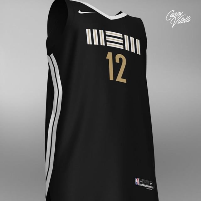
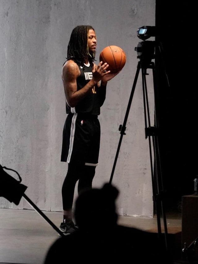
Don’t like the lettering. Not terrible overall but previous years were better
mand3rson94
… meh
Alternative-Target31
Nothing about this says “City of Memphis” like the City jerseys should.
I feel like we went from these super artistic city edition jerseys that took bold chances (from a uniform perspective) to deliver something “different” and just made it “here’s the most basic concept that uses basic colors.”
theglicky
ok i guess, definitely the worst since 2018
DarthGipper18
Boring
nam67
I always loved this design but i agree with others that it doesn’t make for a good jersey “focal point”. imo it’s better as a subtle accent to the fits
sbstooge
Definitely the weakest city edition of the last 5 years, will likely cop it as a replica to add to my collection but don’t think I’d pay full price for it
GotMoFans
I’d put it in the B+ group.
Not on the level of the “I have a man” or “Stax” but better than last years and the wrestling one.
Thunder-ten-tronckh
Idk y’all I think it’s clean af and will look fantastic on broadcast.
killtakerzero
Why tho
MikeConleyIsLegend
My First Thoughts:
Not as cool as the past couple ones we’ve had. Kinda hard to top throwbacks, dark blue and yellow, and early 2000s rap album themed jerseys.
Very simple and clean so it should look great on TV.
Black white and gold can never really go wrong, just a safe, decent jersey. While I do love black jerseys, we’ve had a bunch recently so would’ve liked something different and out there.
More excited for the reported return to Vancouver/early Memphis throwbacks the next couple seasons after this. I’m thinking they will both be the white away ones tho which aren’t as cool as the teal Vancouver and the black/red/teal Memphis ones.
toftr
We have had so many black and white alternate jerseys
deadflagblues
…booooooring.
The 2020’s were amazing. Should really go back to that general design scheme.
syo
Boring.
TheStuffisLegal
This is atrocious and boring. No chance I’m buying this
Bubbly_Visit
Bro these nike jerseys fucking suck
omgshannonwtf
~*sigh*~
The ‘20/‘21 editions were so hot. This looks like they didn’t even try.
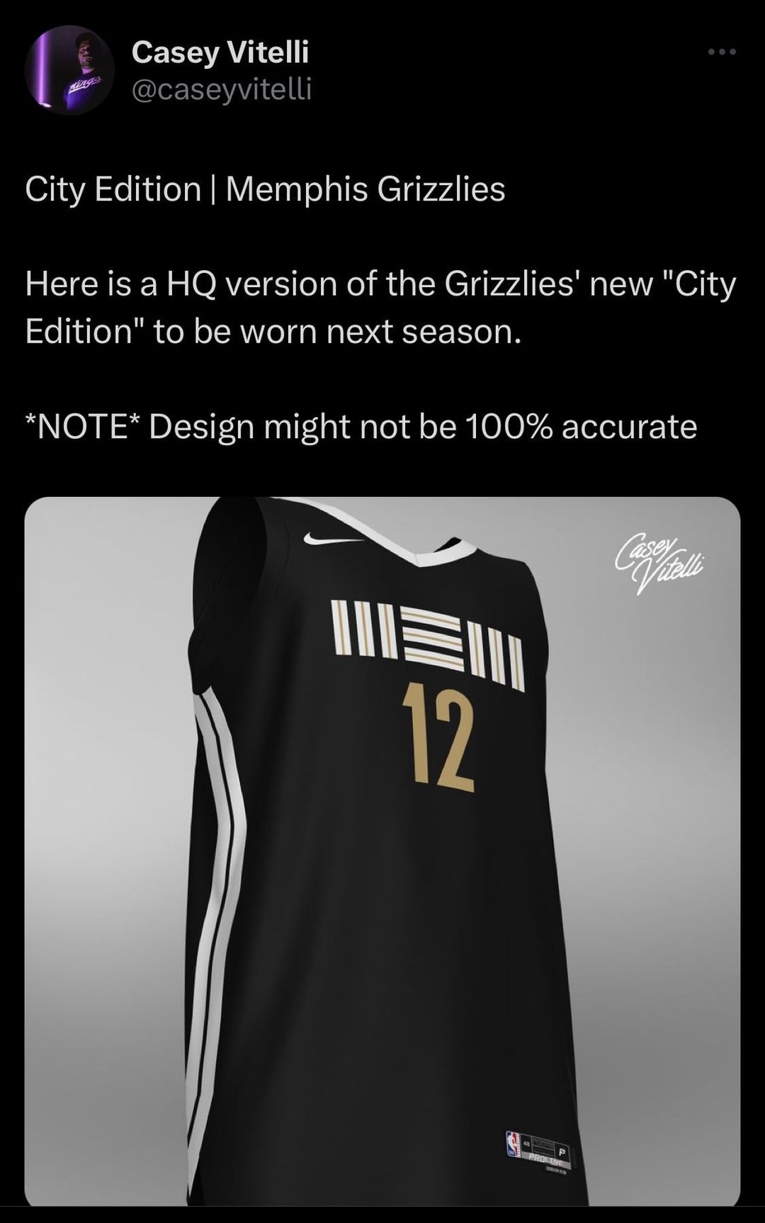


17 Comments
Don’t like the lettering. Not terrible overall but previous years were better
… meh
Nothing about this says “City of Memphis” like the City jerseys should.
I feel like we went from these super artistic city edition jerseys that took bold chances (from a uniform perspective) to deliver something “different” and just made it “here’s the most basic concept that uses basic colors.”
ok i guess, definitely the worst since 2018
Boring
I always loved this design but i agree with others that it doesn’t make for a good jersey “focal point”. imo it’s better as a subtle accent to the fits
Definitely the weakest city edition of the last 5 years, will likely cop it as a replica to add to my collection but don’t think I’d pay full price for it
I’d put it in the B+ group.
Not on the level of the “I have a man” or “Stax” but better than last years and the wrestling one.
Idk y’all I think it’s clean af and will look fantastic on broadcast.
Why tho
My First Thoughts:
Not as cool as the past couple ones we’ve had. Kinda hard to top throwbacks, dark blue and yellow, and early 2000s rap album themed jerseys.
Very simple and clean so it should look great on TV.
Black white and gold can never really go wrong, just a safe, decent jersey. While I do love black jerseys, we’ve had a bunch recently so would’ve liked something different and out there.
More excited for the reported return to Vancouver/early Memphis throwbacks the next couple seasons after this. I’m thinking they will both be the white away ones tho which aren’t as cool as the teal Vancouver and the black/red/teal Memphis ones.
We have had so many black and white alternate jerseys
…booooooring.
The 2020’s were amazing. Should really go back to that general design scheme.
Boring.
This is atrocious and boring. No chance I’m buying this
Bro these nike jerseys fucking suck
~*sigh*~
The ‘20/‘21 editions were so hot. This looks like they didn’t even try.