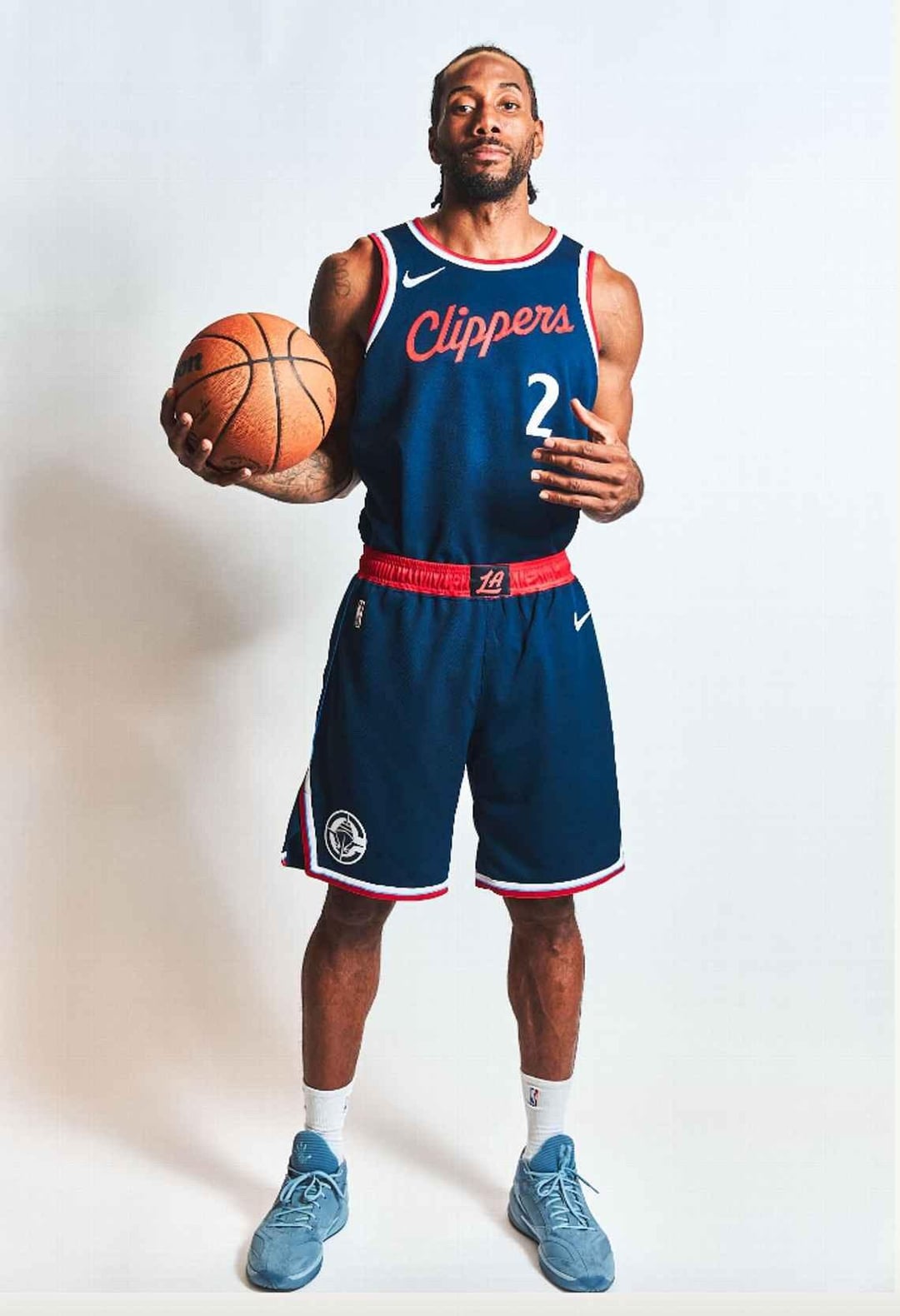
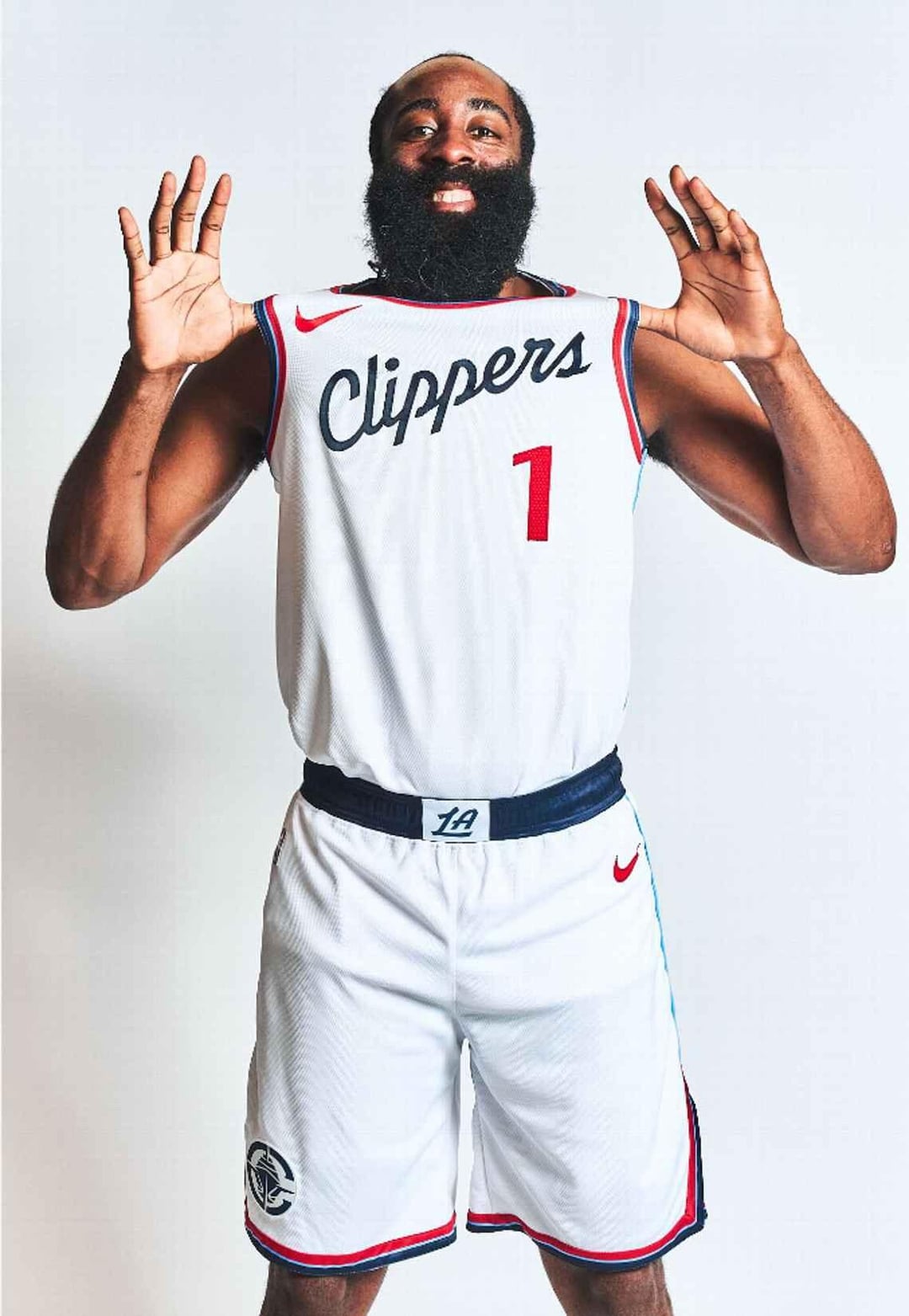
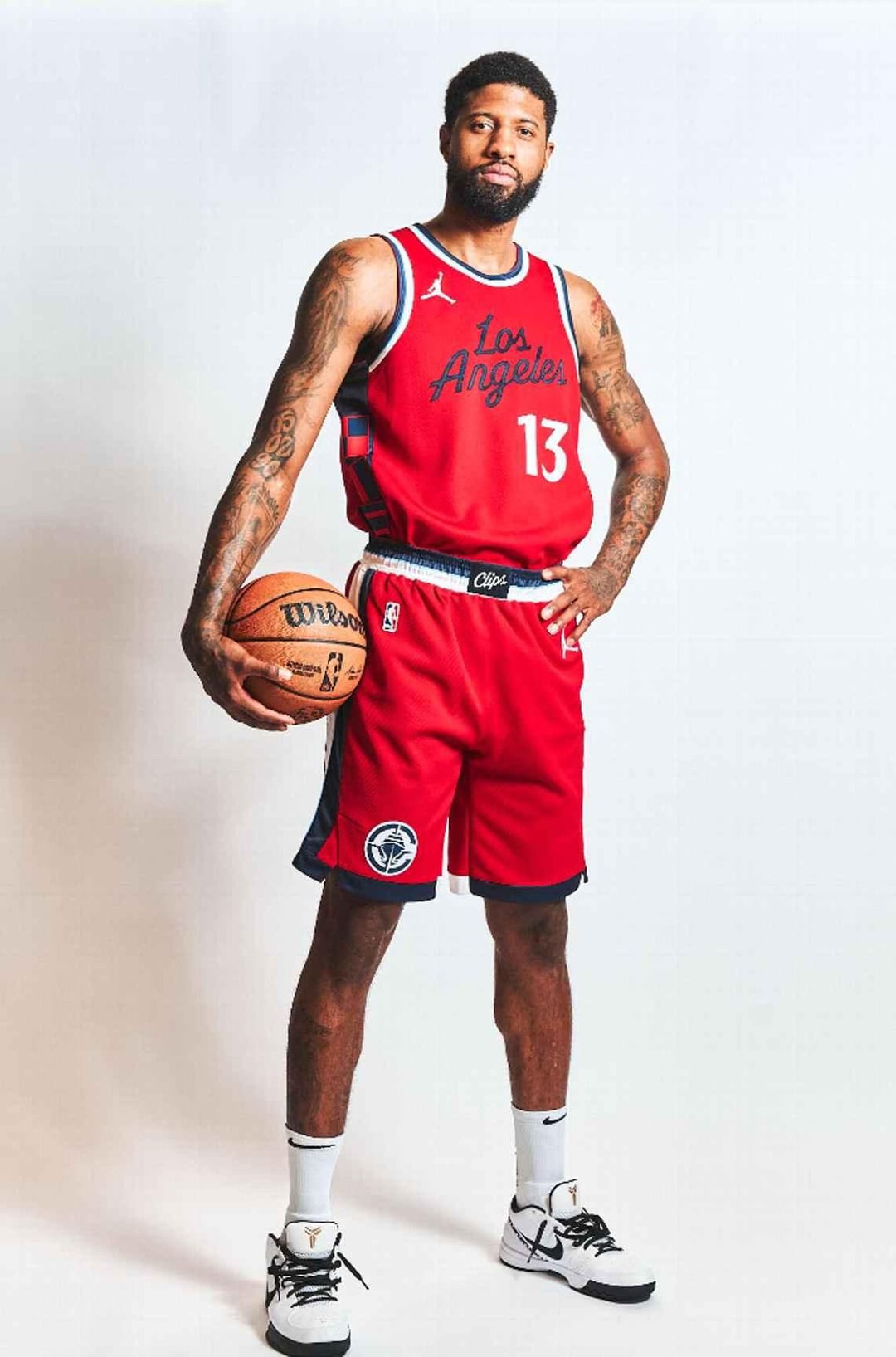
The red ones are fire, between the jumpman logo and ‘Los Angeles’ it fills the jersey in really well. Verdict still out on the other ones, will have to see them a bit more, but definitely some elements I like from all 3. Feels like you can see bits of the Walton early 80s blues and the 2018 City unis mixed in as well
itsiceyo
no fucking way. is this real life??!?!!! these are fucking awesome!!
<3 im in love with the cllippers all over
Sarah7667
What is this? No, just please no, can’t you find a good designer? That should be so simple, or pay attention to fans desires, check the chats on Opingo like
AeroXero
The logo with the colors in it is so nice.
Sfr33123
Love the jerseys. Logos a bit mid but still a huge improvement on our current logo
Enchanted-2-meet-you
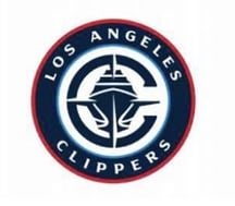
I’m not from la or anything so I’m just asking – what does the central part of the logo mean? I can’t exactly tell what it looks like
TonyGFool
Nautical vibe is sick!
-profile1
Thank god they are leaning into the boat theming. Super sick rebrand loving it so far
5fives5
Looks great!
Snarwib
BOAT
SadMix5355
The new flippers?
E2A6S
Omg it’s real, Harden and PG resign next
PlatinumPlayer
May be downvoted to hell for my opinion, but I’m not feeling the ship. It’s a little too much IMO. I love the idea of an anchor or something else nautical themed. I like everything about the jerseys, just not a huge buyer on the logo itself.
Mattywestside22
I’m a fan. These are clean.
stay_basic
Great job clips! I love how they went Navy as the primary blue as well 🔥 I dig this alot
Just-Security7915
I LOVE THE NEW LOGO
Ikigai_Mendokusai
Circular Logo is meh but those uniforms are fire af. Especially the red one.
I feel like other teams fans will find it boring/dated but long-term fans will really love it. Those kits are really nice, I’m not a huge fan of the new logo with the ship but it could be worse.
CarelessTaco
I’m really digging it!
TanaTalk3
these go stupid hard 🔥
Magic_Jordan
FINALLY!!!!!
All of this is fire. Bravo 👏👏👏
LostHypnosis
Not a Clippers fan but these are fresh, they killed it
superduperdoobyduper
i just nut
the-kza
glad they changed the number font. wish they kept the mr cartoon stuff
brkfstfd
Not a Clips fan (not really a fan of anyone as I’m not in any NBA market) so here’s a neutral POV: it’s an aggressive enough change that there will be some extra bellyaching on top of the nominal amount you’d get from any new logo, but I think it’s got high potential to be a beloved classic far down the long road.
Practically all new team brands and rebrandings seem silly as hell at their onset before settling out later. Most become fine, some become great. Rare is the situation like with the Commanders where the brand is genuinely D.O.A bad.
besttotop
Awesome
QuinnAngelWraith
Everything is an upgrade I cannot lie
bucchi10
I really didn’t like the logo but those uniforms looks nasty af.
LLUrDadsFave
So grateful they didn’t go for pink and baby blue. The shit is sick. The red jerseys are fire.
BurnerForDaddy
I love this. 1000% better than the current logo and I’m so happy they are finally leaning into the nautical theme. Stop running from the team name!
I am very happy with these. Will miss the lighter blue but besides that I think these are great.
cause_4_concern
You know what?! It’s alright!
hyrulegangsta
Like them, better than the current bland ones.
aprilmayjune2
love it, glad they listened and brought the cursive back.
logo looks like some of the fan art of the past too


46 Comments
The red ones are fire, between the jumpman logo and ‘Los Angeles’ it fills the jersey in really well. Verdict still out on the other ones, will have to see them a bit more, but definitely some elements I like from all 3. Feels like you can see bits of the Walton early 80s blues and the 2018 City unis mixed in as well
no fucking way. is this real life??!?!!! these are fucking awesome!!
<3 im in love with the cllippers all over
What is this? No, just please no, can’t you find a good designer? That should be so simple, or pay attention to fans desires, check the chats on Opingo like
The logo with the colors in it is so nice.
Love the jerseys. Logos a bit mid but still a huge improvement on our current logo
I’m not from la or anything so I’m just asking – what does the central part of the logo mean? I can’t exactly tell what it looks like
Nautical vibe is sick!
Thank god they are leaning into the boat theming. Super sick rebrand loving it so far
Looks great!
BOAT
The new flippers?
Omg it’s real, Harden and PG resign next
May be downvoted to hell for my opinion, but I’m not feeling the ship. It’s a little too much IMO. I love the idea of an anchor or something else nautical themed. I like everything about the jerseys, just not a huge buyer on the logo itself.
I’m a fan. These are clean.
Great job clips! I love how they went Navy as the primary blue as well 🔥 I dig this alot
I LOVE THE NEW LOGO
Circular Logo is meh but those uniforms are fire af. Especially the red one.
Looks like the wizards
Full story
https://www.espn.com/nba/story/_/id/39586633/nba-story-clippers-new-uniforms-logos
It looks SO GOOD!!! I CAN’T WAIT!
I feel like other teams fans will find it boring/dated but long-term fans will really love it. Those kits are really nice, I’m not a huge fan of the new logo with the ship but it could be worse.
I’m really digging it!
these go stupid hard 🔥
FINALLY!!!!!
All of this is fire. Bravo 👏👏👏
Not a Clippers fan but these are fresh, they killed it
i just nut
glad they changed the number font. wish they kept the mr cartoon stuff
Not a Clips fan (not really a fan of anyone as I’m not in any NBA market) so here’s a neutral POV: it’s an aggressive enough change that there will be some extra bellyaching on top of the nominal amount you’d get from any new logo, but I think it’s got high potential to be a beloved classic far down the long road.
Practically all new team brands and rebrandings seem silly as hell at their onset before settling out later. Most become fine, some become great. Rare is the situation like with the Commanders where the brand is genuinely D.O.A bad.
Awesome
Everything is an upgrade I cannot lie
I really didn’t like the logo but those uniforms looks nasty af.
So grateful they didn’t go for pink and baby blue. The shit is sick. The red jerseys are fire.
I love this. 1000% better than the current logo and I’m so happy they are finally leaning into the nautical theme. Stop running from the team name!
I am very happy with these. Will miss the lighter blue but besides that I think these are great.
You know what?! It’s alright!
Like them, better than the current bland ones.
love it, glad they listened and brought the cursive back.
logo looks like some of the fan art of the past too
​
[https://boards.sportslogos.net/topic/105964-los-angeles-clippers-logo-concepts-roundel-roundel-roundel/](https://boards.sportslogos.net/topic/105964-los-angeles-clippers-logo-concepts-roundel-roundel-roundel/)
Looks like shit
Red jersey has the nautical flag trim!
Love the jerseys wowww. Way better than the old ones. The logo is fine. I wish they would have made the ship more cartoonish. Overall nice job.
Does it remind anyone else of the Seattle Marriners badge. Not a baseball fan or even American but just off the top of my head.
RED UNIS GOT THE NAUTICAL TRIMS ON THE SIDE OH MY GOD THESE SHITS IS TOUGH
jerseys are soooo clean
Getting NHL vibes with this logo, but the uniforms are nice.
looks more like a cruise ship to me lol
Amazing
Wolves fan here saying I really dig the logo and uniforms… one of those rare well done rebrands. Congrats!