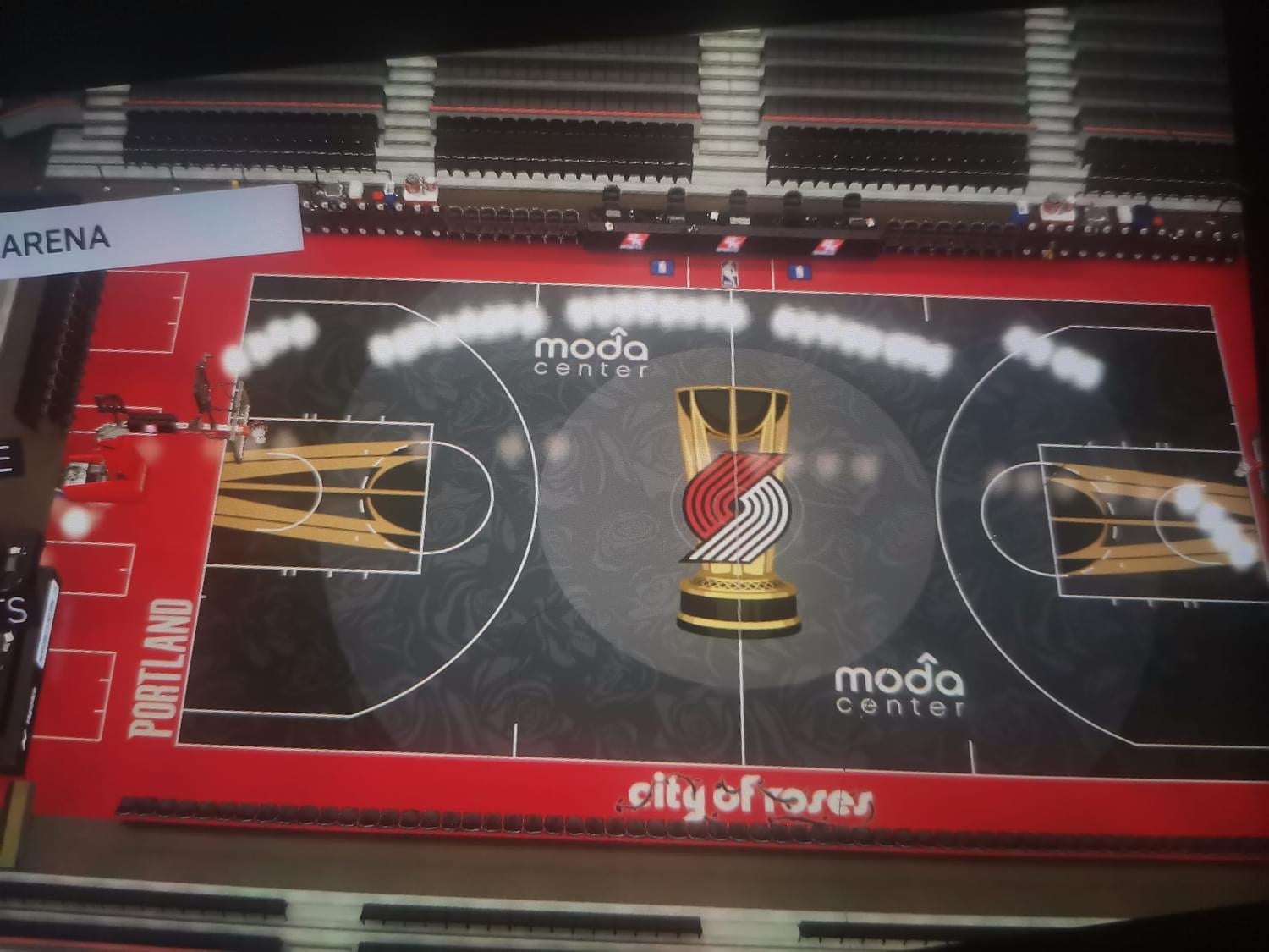
via Christian Soleño on FB who has found the IST courts on 2K.
https://www.facebook.com/share/p/Wju9NimbPnYy8mZ2/?mibextid=K35XfP
by ajmcgill

via Christian Soleño on FB who has found the IST courts on 2K.
https://www.facebook.com/share/p/Wju9NimbPnYy8mZ2/?mibextid=K35XfP
by ajmcgill


7 Comments
The black floor really does look like something out of 2k, but I don’t mind this. Certainly looks way better than last year, and I like the fact that the NBA is trying to make these games feel different. Now, if only they did this for the playoffs…
I really like this!
Huge upgrade from last years IMO. Love the rose pattern design and the black/grey being the major color for the floor as opposed to the red. Just scrolled through all the the other courts and I think ours is easily the best
These would all be so much better if they took the stupid giant cup off center court. You already have the pseudo-cups in the key, why force the motif in there for a third time?? Nobody gives a shit about this trophy anyway 😄
Much better than last year’s abominations tbh.
Still not totally a fan but I love the “city of roses” in that font. The subtle roses throughout the black too. This could actually be a W
i still don’t get the point of the in-season “tournament”. it literally means nothing. it’s just a handful of extra betting lines.
Some day there should be a little watch face with a D in it right where Dame finished off OKC.