
Personally, I really enjoy the new jersey this season. Much more than the past 2. Obviously it would look much better if it said "Denver" but we can only expect so much at this point.
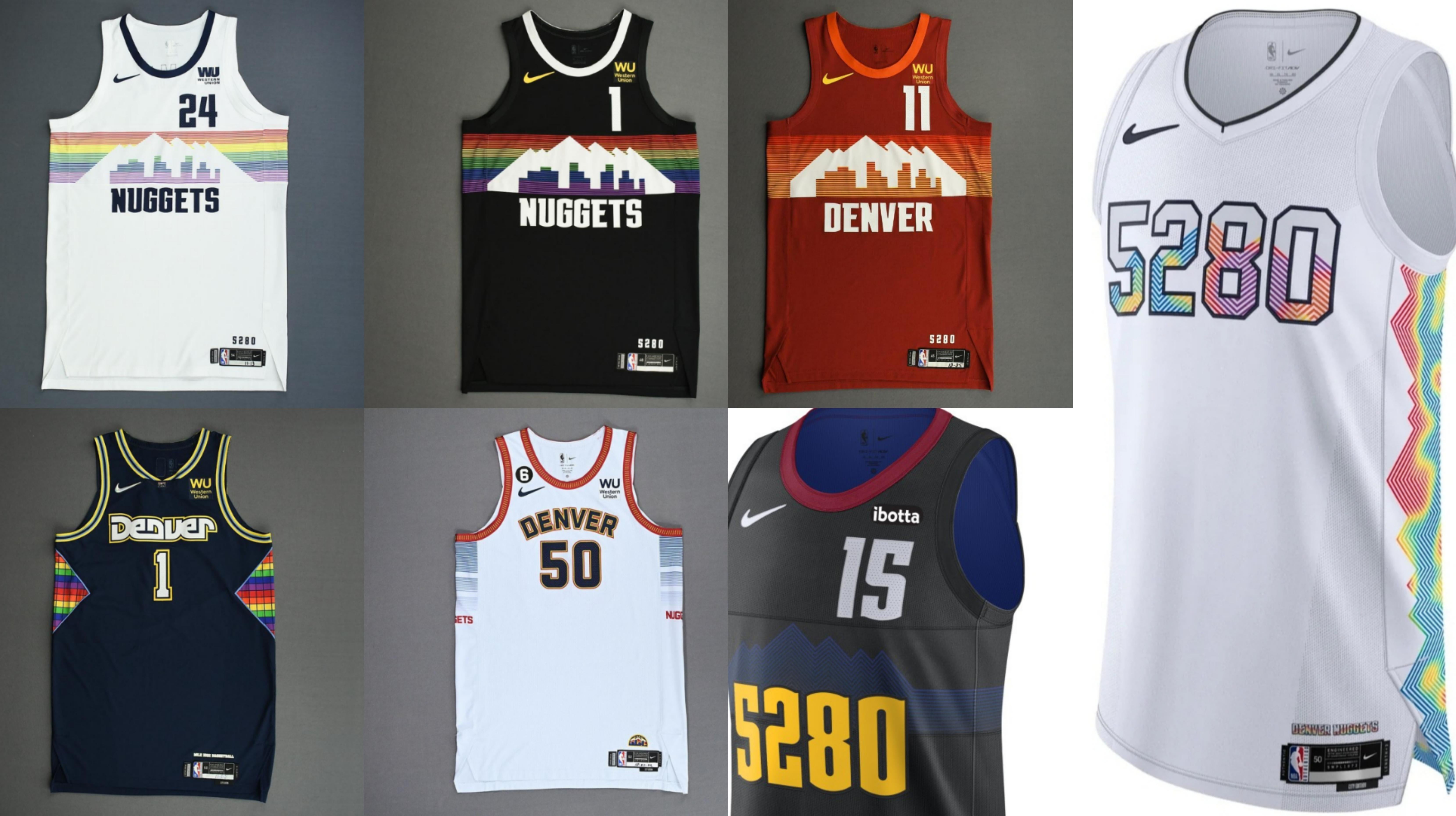
Here's my personal rankings: Black Rainbow Skyline > White Rainbow Skyline > Rainbow Tetris > 5280 Trippy Topographic Map > Red Skyline > White Union Station > 5280 Black
by griffskry
26 Comments
My ranking:
1. Black Skyline
2. White Skyline
3. Rainbow Tetris
4. Union Station (winning a championship in these helps)
5. This year’s mountain topographic
6. Red Skyline (I really dig the “Red Rocks” theme, but feel it could have been pulled off a little better)
7. Black 5280’s
I like almost all of them. My rank would be
1. White Skyline
2. Black Skyline
3. Union Station
4. White 5280
5. Jersey History Mix
6. Black 5280
For those curious, under the current Nike deal teams are only allowed to keep a style for up to three years, which is why we didn’t just keep pumping out skylines.
I’m good with 5 of those 7 and feel that’s a solid ratio. There is an issue with how much of that is backloaded but this season clears despite not being perfect, so there’s hope.
That top row is top tier… everything after is kinda meh
Other than the black and white skyline they’re all pretty ass. It’s just disappointing that Nikes only goal is push out jerseys and make money. It sucks we only got the white and black skylines for 1 season
Really love the trippy mountains on the side for this year but too much white and 5280 is over played. Rather we just say Mile High City or something like that. Even better, Denver or Nuggets….
Every year we stray further from the light
I actually like them all except last years so hard disagree.
There’s the Union Stations…..and then everything else.
We sure do.
Whose leg do I have to hump to get a blue or gold skyline jersey in here?
I think they’re all pretty fantastic
All I want is them to bring back the powder blue uniforms and stop with the 5280 😵
Are they better than last years? My god, yes.
Are they as good as they can be? Absolutely not.
The two 5280 jerseys are the only ones that don’t do it for me. This new one seems like the worst one yet imo
I like the topographical heat map on the side of the new ones. That’s the only good thing.
Black Skyline is forever on top. Just picked up a signed AG one earlier this year
Red skyline is the best
The 5280s are one of the worst jerseys ever.
I really do wish Nugs would go back to their cool logo. Not a fan of the ones since the skyline.
Your 2024-2025 Denver 5280’s! Tickets on sale now.
I really wish they would stop with the yearly city edition drops. It’s pretty clear that league wide they’re running out of inspiration and they’re all getting pretty stale, if not just outright bad
Take the denver with the font from the bottom left jersey and put it on the new one and it’s perfect
The rainbow mountain/skyline is iconic. Further we go from that the worse they look.
I’ve been pretty disappointed with the concept of the “City” Jersey so far.
Think about it, the skylines were a no brainer that any nuggets fan would have said “let’s make an alternate uniform based on the most famous jerseys from our franchise’s history”. Even then the white skylines didn’t really pop, and the reds were just weird (the black skylines are chef’s kiss perfection).
The 75th anniversary mashup gets a pass from me because they did a decent job of creating a coherent uniform while using a bunch of different elements.
The union station uniforms are simply boring.
The black 5280 were terrible because 1) you can’t see the mountains when the players wear them on court. 2) they freaking say 5280 on them. I do think these could have been good if the topographic lines were thicker and a brighter blue and the jerseys said nuggets (you know the name of our team).
These new white 5280s I feel are a complete abomination. I actually don’t think they could make anything worse.
What’s frustrating is the nuggets have so many fun themes to draw from like Maxie the miner, rainbows skylines, pickaxe skywalker era, etc and they roll these designs out that look like they have very little thought and connection to our franchise.
No reason to not just keep the black and white skyline
That black skyline was so good. IMO everything on the left, including the Union Station, has been good. Everything on the right is trash.